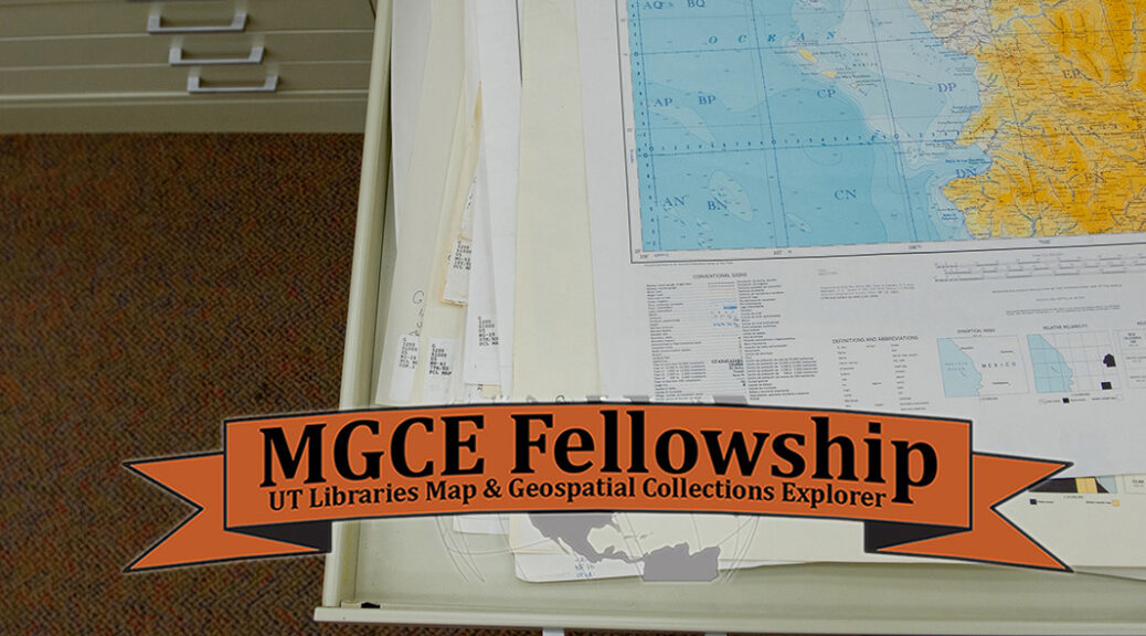
It was a great year for the Libraries’ 40 Hours for the Forty Acres giving campaign. This year’s efforts centered around sustaining the Map & Geospatial Collections Explorer Fellowship – a vital initiative aimed at fostering innovative scholarship and leveraging the rich resources housed within the UT Libraries’ map and geospatial collections – and an endowment for the Digital Scholarship Program administered by the Benson Latin American Collection and the Lozano Long Institute of Latin American Studies.
The 40 Hours for the Forty Acres serves as a rallying point for the university community, bringing together alumni, students, faculty, staff, parents, and friends in a collective effort to bolster initiatives that resonate with their interests and goals for UT.
This year’s campaign resulted in nearly $30,000 raised in support of the Map & Geospatial Collections Explorer Fellowship, which has been instrumental in advancing research and facilitating academic exploration. These funds will play a pivotal role in sustaining and expanding the scope of the award, ensuring that it continues to serve as a catalyst for groundbreaking research and scholarly inquiry.
Since its inception, the Map & Geospatial Collections Explorer Fellowship has provided invaluable support to UT scholars, offering financial assistance and resources to support their explorations into diverse fields. Through the Fellowship, recipients have been empowered to delve into projects ranging from mapping rising sea levels on the Texas coast to creating artistic spatial visualizations of biodiversity in Hawaii. The impact of these projects extends far beyond the university campus, contributing to advancements in various disciplines and enriching our collective understanding of the world.
The second campaign raised just over $20,000 towards the creation of an endowment for the Digital Scholarship Program administered by the Benson Latin American Collection and the Lozano Long Institute of Latin American Studies. The LLILAS Benson Digital Scholarship Program aims to advance Latin American Studies through the ethical application of digital tools in the realm of translation, accessibility, language preservation, and more. The funds raised during this campaign get LLILAS Benson one giant step closer to funding their Digital Scholarship Program in perpetuity, through the creation of an endowed fund.
The Libraries extends its sincerest thanks to all who contributed to the success of this year’s campaign. Your generosity has not only provided vital support for the Map & Geospatial Collections Explorer Fellowship and the Digital Scholarship Program, but has also reaffirmed the importance of investing in initiatives that advance knowledge and scholarship.
These annual campaigns continue to bring exciting, crowd-funded support to the UT Libraries and its various endeavors, collections, and programs. We look forward to sharing the successes of the programs supported during this year’s 40 Hours for the Forty Acres.
To make an additional contribution to either of the campaign efforts, visit:
Read, hot & digitized: Librarians and the digital scholarship they love — In this series, librarians from the UT Libraries Arts, Humanities and Global Studies Engagement Team briefly present, explore and critique existing examples of digital scholarship. Our hope is that these monthly reviews will inspire critical reflection of, and future creative contributions to, the growing fields of digital scholarship.
Segregation By Design is a compelling personal project by Adam Paul Susaneck, an architect based in New York City. Through spatial analysis, demographic data, historical photos, and extensive research, Susaneck effectively illustrates “how the American city was methodically hollowed out based on race.” It offers an insightful perspective on an important issue that has shaped the country’s history and continues to impact its present. The project’s goal is threefold: to create a print “Atlas of Urban Renewal,” to create digital materials for local groups opposing ongoing freeway expansion, and to raise awareness through social media.
Screenshot of the Chicago, Illinois page on Segregation By Design.
The website offers a preview of what the print atlas will look like. 180 municipalities that received federal funding from the 1956 Federal Highway Act have been analyzed, and so far, there are 14 cities profiled. Each city has multiple sections, such as “Freeways & Urban Renewal,” “Redlining,” and “Transit.” Focus is given to specific highways, neighborhoods, environmental impacts, or buildings.
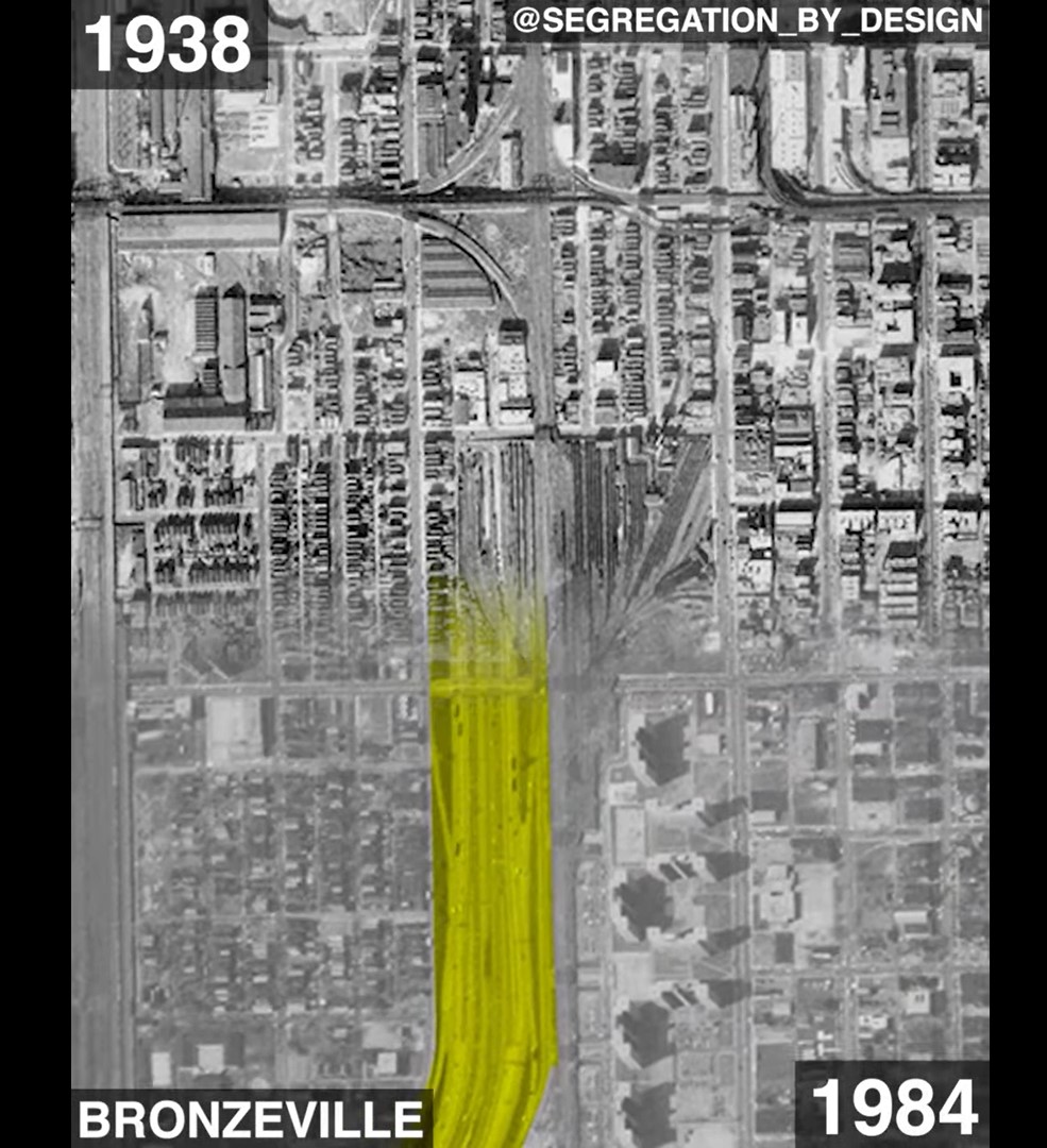
For example, the “Chicago: Dan Ryan Expressway (I-90)” section includes an animated swipe map juxtaposing aerial photos from 1938 and 1984 illustrating the “path of destruction” and displacement when the I-90 highway was built in the 1960s. It explains that over 81,000 people, many of whom were BIPOC or recent immigrants, were displaced.
Video still from Chicago: Dan Ryan Expressway by Segregation By Design.
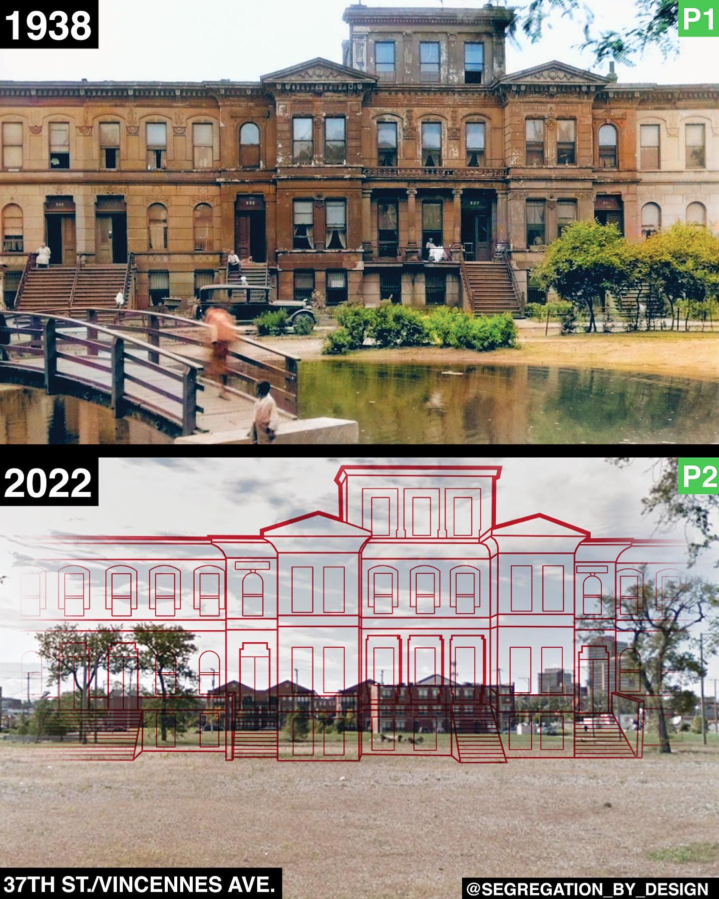
Likewise, the “Chicago: Bronzeville” section profiles a neighborhood decimated by “urban renewal.” Before and after photos of buildings are combined with Susaneck’s transposed line drawings of buildings over present-day photos, masterfully visualizing and mapping redlining of the area.
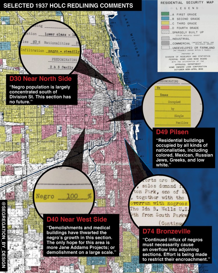
Redlining is a discriminatory practice that systematically denies services such as mortgages, insurance loans, and other financial services to specific area residents based on race or ethnicity.
Redlining map of Chicago with selected comments from the redlinign notes from Segregation By Design.
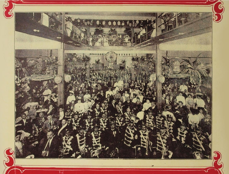
Yet another section, “Chicago: Pekin Theater,” focuses on the first black-owned theater in the United States, which was appropriated by the city through eminent domain, a process that left large swaths of the neighborhood cleared for “urban renewal.” The lot has been vacant since 1940.
Established in 1905, the Pekin Theater was the first Black-owned musical theater in the country from Segregation By Design.
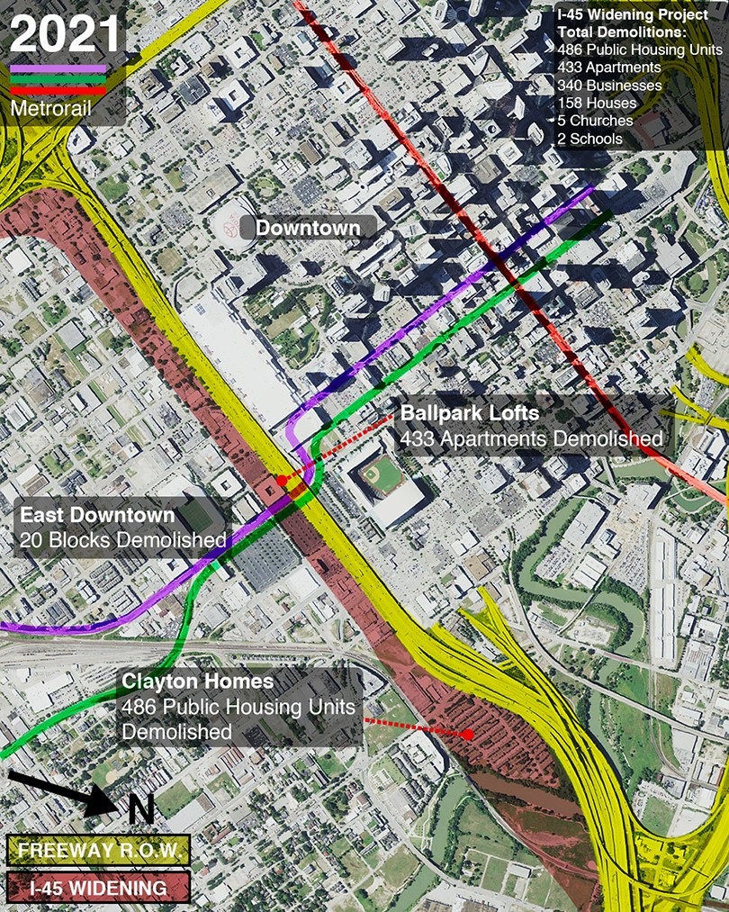
The project’s second goal is to create digital materials for local groups opposing ongoing freeway expansion. Susaneck states, “As state governments continue to mindlessly widen freeways, community groups in cities across the country have formed in opposition. This project aims to support these groups by creating easily digestible graphics to spread awareness.” One such project is Stop TxDOT I-45 in Houston, Texas. Their mission is “to challenge the status quo of transportation policy and to fight for all people in Houston to be able to participate in the decisions that affect health, safety, and mobility in their communities.” Similarly, the “Houston: Flooding” section of Segregation By Design discusses the environmental impact of highways and urban sprawl and how nonwhite residents are disproportionately affected by natural disasters.
Houston, Texas, proposed I-45 expansion from Segregation By Design.
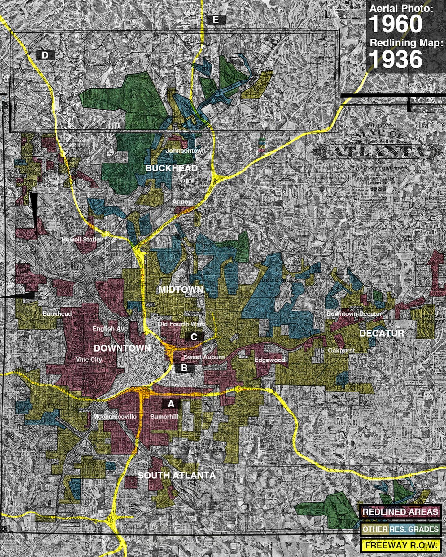
Susaneck is accomplishing his third project objective of raising awareness through social media. In fact, Segregation By Design first caught my eye with an Instagram post that highlighted a striking map of Atlanta followed by bird’s-eye images of highway construction clearance from 1956 to 1990. The caption is lengthy for Instagram but is engaging. Susaneck describes the images in it: “The first image shows the freeway right of way overlaid on the 1936 HOLC redlining map and a 1960 aerial photo. The subsequent images show the destruction wrought by freeway construction.” Susaneck then explains who was affected by the highway construction, gives the names of neighborhoods decimated, and expounds on the history of redlining. Instagram lends itself to the graphic nature of his work, the dynamic swipe maps (often used to illustrate before and after destructive events), then-and-now comparisons, and augmented photos highlighting the significance of buildings as well as homes and communities that have been demolished.
A 1960 aerial photo with a 1936 redlining map and freeway right of way overlayed, Segregation By Design.
For readers not on Instagram who still want updates, you can sign up to receive new entries via email, including high-resolution images and maps. Supporters can contribute to this largely self-funded project through the subscription-based platform Patreon.
Segregation By Design uses engaging infographics and directness to help explain the complicated policies contributing to systemic racism in our country. It’s invaluable in making these issues more manageable and understandable. I look forward to adding the Atlas of Urban Renewal print version to the Perry-Castañeda Library (PCL) Map Collection.
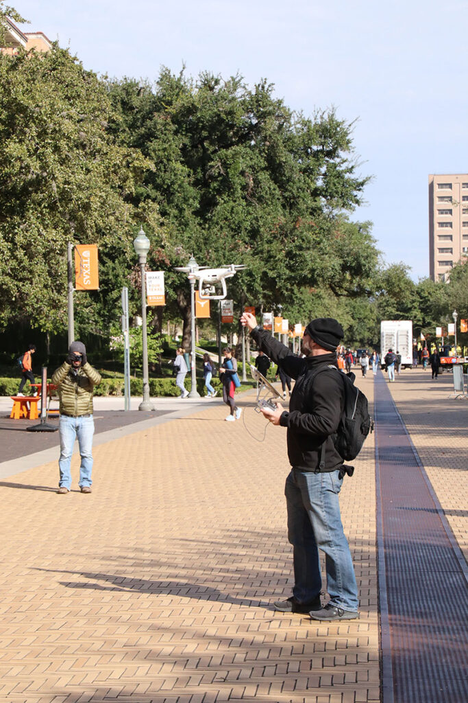
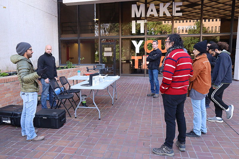
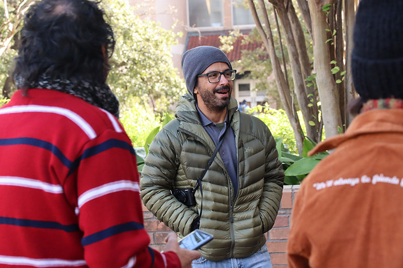
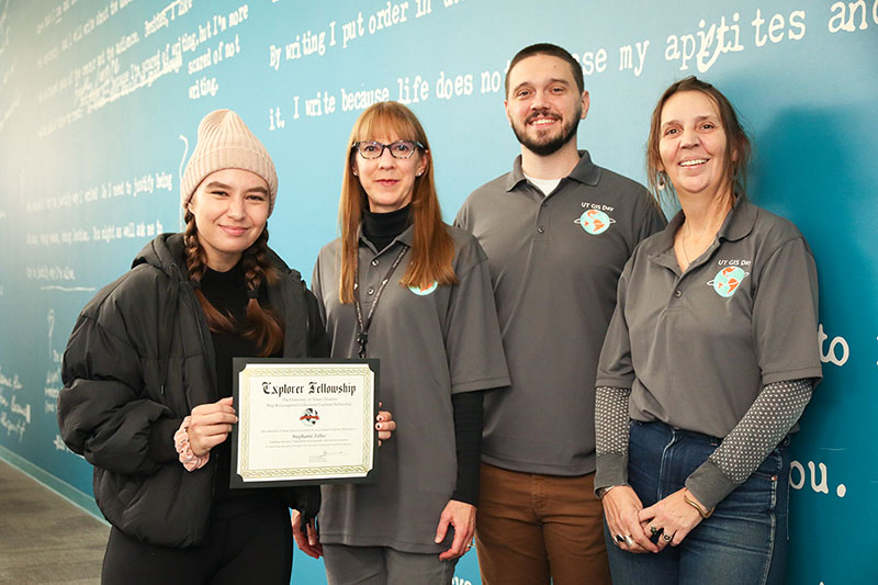
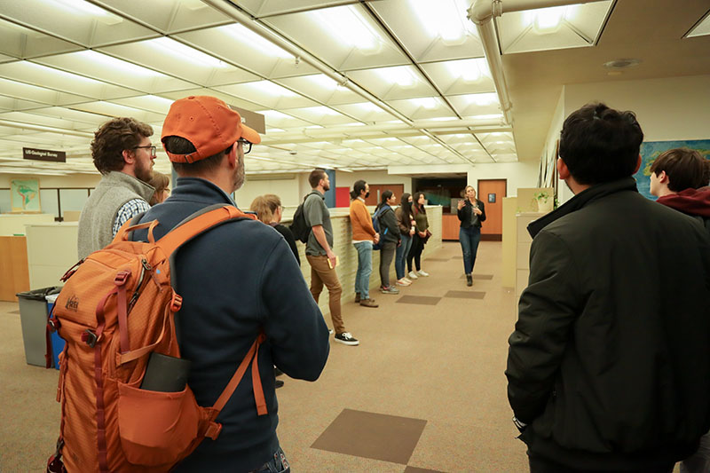
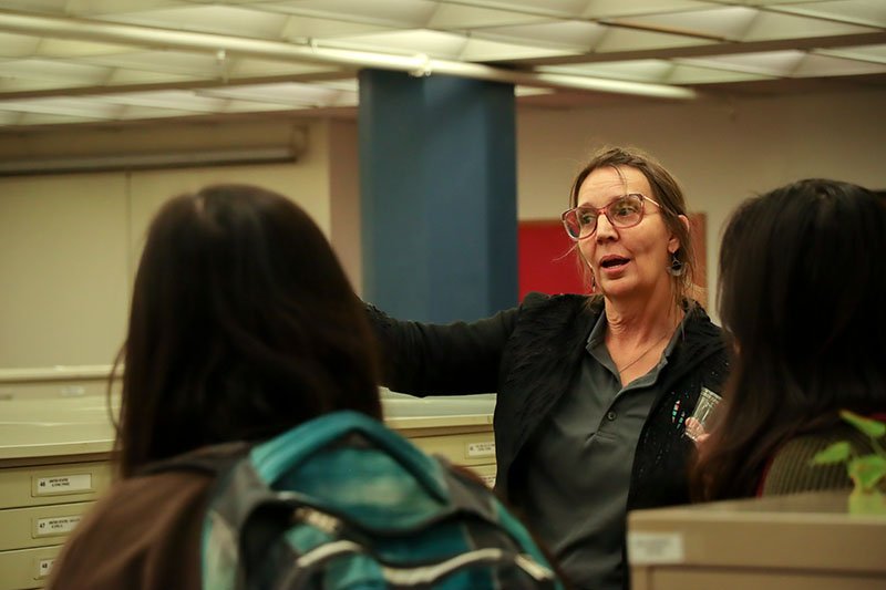
For the 4th consecutive year, the UT community came together to celebrate geographic information systems and geospatial research at UT GIS Day 2022 on Wednesday 11/16.
The day’s events were organized by the UT Libraries in collaboration with other campus partners including Technical Resources, the Department of Geography and the Environment, and the Department of Statistics and Data Sciences. We also once again joined other GIS Day organizers from across the state of Texas in contributing to TxGIS Day – a joint effort to spread the word about and increase the impact of our individual GIS Day events.
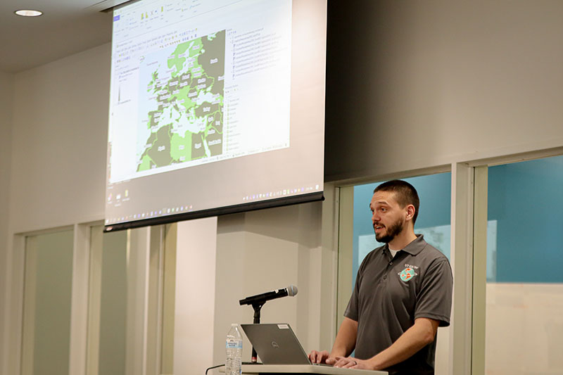
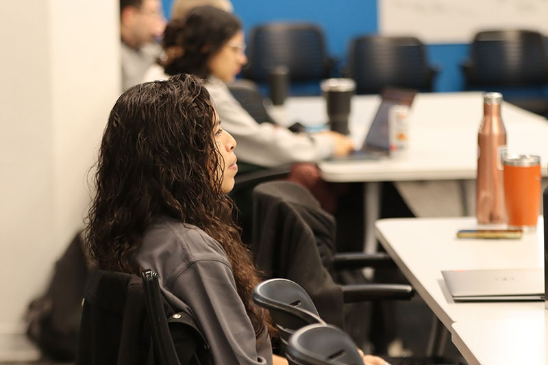
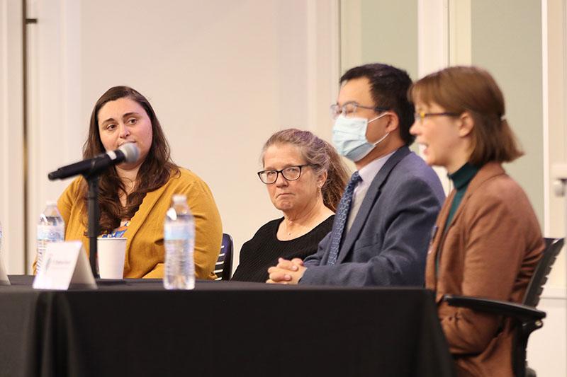
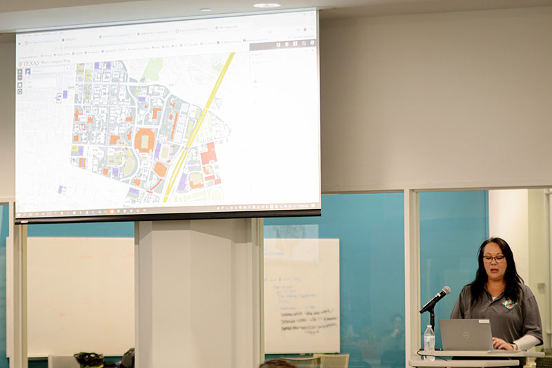
Our events this year were dedicated to recognizing, discussing, and learning about GIS technology and all that it enables for UT Austin students, faculty, and staff. UT GIS Day 2022 was also notable for being our biggest GIS Day celebration yet and featured a full lineup of events including a career event, lightning talks, geospatial health research panel discussion, UAV demonstration, lidar visualization event, PCL Map Room tour, and more. Some of the highlights of the day’s events included the very interactive and well attended GIS poster session and the announcement of the student recipient of the 2022 UT Libraries Map & Geospatial Collections Explorer Fellowship which was awarded to graduate student, Stephanie Zeller.
Many of our events were held in and around the Perry-Castañeda Library which proved to be a fantastic venue for bringing members of the campus community together in a hybrid format that allowed us to enjoy the advantages of gathering in-person while also being able to stream and record many of our sessions using Zoom. These recordings can be accessed at https://guides.lib.utexas.edu/gis/past-event-info-and-downloads which will allow these events to continue to benefit the campus community moving forward.
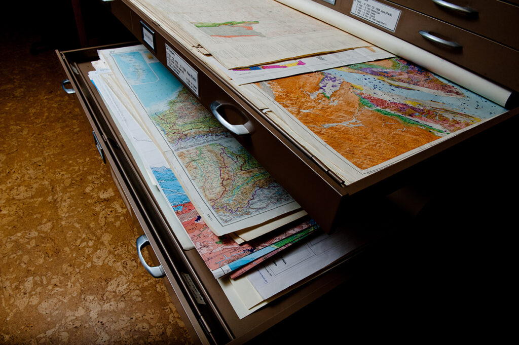
A project to provide digital access to an important collection of geologic cartography from the Walter Geology Library has been completed.
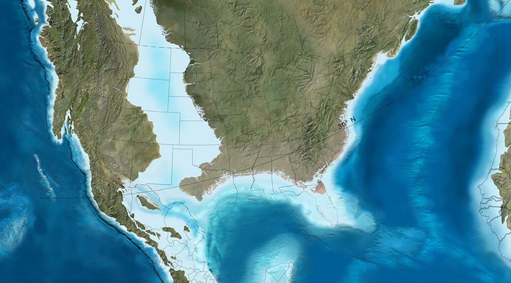
The Deep Time Maps are a collection of paleogeographic maps showing the landscapes and oceans of ancient Earth through hundreds of millions of years of geologic time. These maps are an extraordinary resource for geoscientists, but have been inaccessible to users due to limits on the technology available for allowing access to this large of a collection.
The project to make this resource accessible online through the Libraries’ online presence was an idea that had been sitting around collecting “digital dust” for quite some time due to limits on the technology available for our use.
Senior Content Management Specialist Stacy Ogilvie took lead on the project to provide digital access to views of the Earth’s continents over the course of millions of years through the Libraries’ unified management resource system component Alma Digital. Adding this collection to Alma Digital is a significant step in increasing its accessibility to our users and fulfilling a goal that our late colleague Dennis Trombatore had in purchasing the materials.
“The process also served as our first big test of adding a large collection to Alma Digital and the experience Stacy gained from working on this from scratch will help inform how we work more closely with SRD and add additional large collections to the Alma Digital workflow,” says Head of Content Management Corey Halaychik. “Her work on this front is invaluable to our team.”
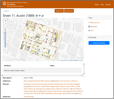
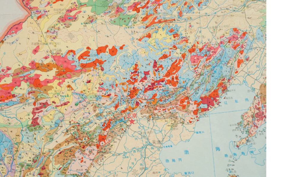
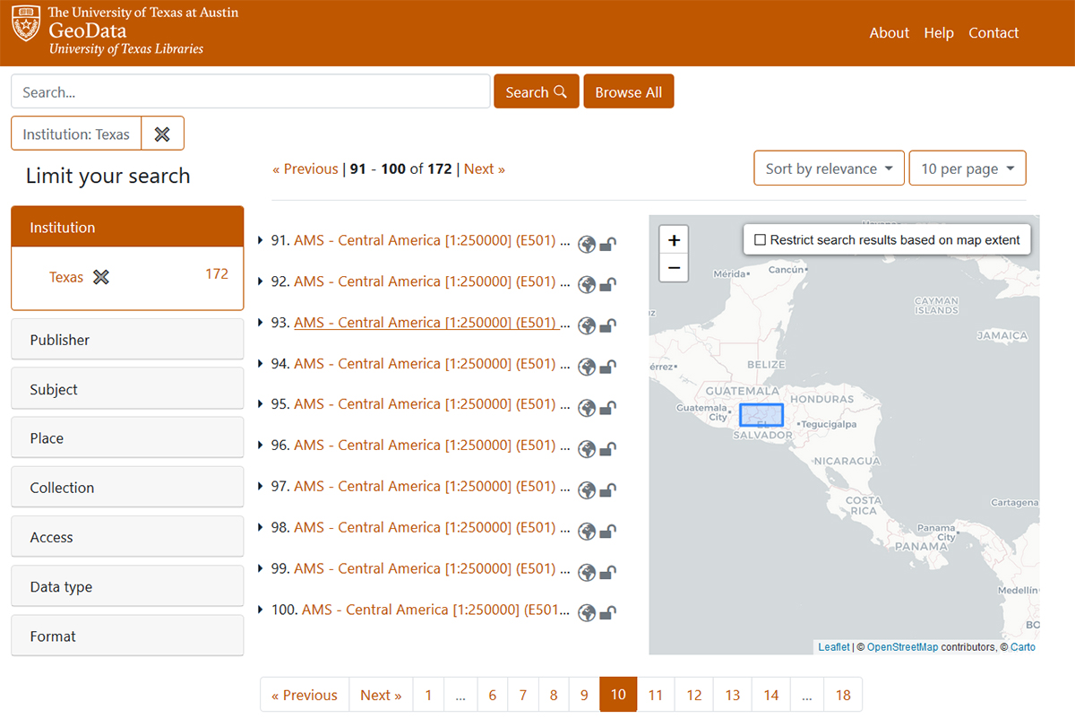
Over the past five years, great strides have been made in enhancing access to the UT Libraries (UTL) maps and geospatial collections. The UT Libraries has for decades been committed to making copyright-free maps from its collections freely available online. This commitment has resulted in the scanning and sharing of tens of thousands of maps from the renowned Perry-Castañeda Library Map Collection (PCLMC), which have been made available for download online for over 25 years. The Libraries’ focus on sharing its geospatial data has also more recently led to the development of the Texas GeoData portal in 2019, which has been a game-changer for enhancing discovery and use of geospatial data and maps from the UT Libraries’ collections. This portal enables access to a wide variety of geospatial data types available for download, including georeferenced scanned maps from the PCLMC and geospatial datasets developed from collections in the Alexander Architectural Archives and the Benson Latin American Collection.
The Texas GeoData portal allows you to download georeferenced maps, like this Sanborn Fire Insurance map of Austin from 1889.
In 2021, the UT Libraries Map & Geospatial Collections Explorer Fellowship was created to incentivize engagement with the Libraries’ geospatial materials like those shared through the PCLMC site, the Texas GeoData portal, the UT Libraries Collections portal. This Fellowship has been designed to both support the work of UT researchers and scholars who utilize UTL map and geospatial assets in their projects and to encourage further enrichment and promotion of the UT Libraries’ map and geospatial collections. The Explorer Fellowship is now offered annually, with two separate award categories: one for UT students of all levels and the other for faculty and post-docs.
On August 22, UTL launched the call for proposals for the 2022 Fellowship awards. Proposals are due October 3, and the Faculty and Student award winners will be announced on GIS Day, November 16, 2022.
Here are some fast fun facts about the Explorer Fellowship to pique your interest:
Fellowship awards are $1500 each, with half distributed upon announcement of Fellowship recipients and half distributed after completion of Fellowship requirements.
Two Fellowships are offered annually, one for active UT students and one for UT faculty and postdocs in current paid appointments.
Maps and geospatial assets that are improved or enhanced by Fellowship awardees will be shared with others through the Texas GeoData portal.
Fellows will have the opportunity to meet and consult with UTL map collections and GIS experts Katherine Strickland and Michael Shensky for project insights and tool guidance.
Researchers selected for Fellowship support will join the nascent ranks of previous recipients doing impressive work whose projects are described below.
2021 Student Fellowship:
Bailey Ohlson
Bailey is studying critical watersheds in Puerto Rico (PR) and their downstream fresh-water reservoirs in order to quantify sediment accumulation rates and identify environmental controls on erosion. She is using maps from the Perry-Castañeda Library Map Collection to characterize past land use in PR and determine their influence on sediment accumulation. She plans on publishing a database of bathymetric data in the UTL repositories with pre-existing bathymetric data from government agencies as well as new data she will be collecting using a bathymetric hydro-drone.
2021 Faculty Fellowship:
Dr. Ginny Catania
The threat from sea-level rise to the Texas coast, which produces ~$400 billion in economic value, is increasingly visible with widespread impacts across human, built, and natural environments. This project plans to build a map of coastal change for the State of Texas to enable the detection of the regions of greatest change (hotspots). By studying hotspot locations in conjunction with environmental data, we can understand the processes responsible for change and how such regions might be impacted from future sea level rise. Map data will be superimposed with demographic data to determine the coastal populations most at risk from sea level and associated threats.
Take a look at the Call for Proposals document for ideas about using geospatial collection items in research you’re planning. It’s possible your project could be elevated by these materials, and incorporating them would enable you to meet the Fellowship application requirements. Please also feel free to share this information about the Explorer Fellowship with any friends or colleagues that you think might be interested in this opportunity.
Read, hot & digitized: Librarians and the digital scholarship they love — In this series, librarians from the UT Libraries Arts, Humanities and Global Studies Engagement Team briefly present, explore and critique existing examples of digital scholarship. Our hope is that these monthly reviews will inspire critical reflection of, and future creative contributions to, the growing fields of digital scholarship.
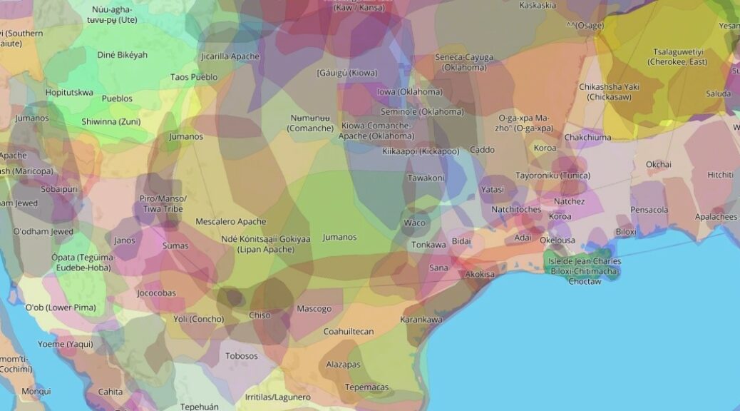
“Join us as we Defend the Sacred” is the first thing you see when you visit the Tāp Pīlam Coahuiltecan Nation website. They are defending remains found under and around the Alamo in Yanaguana, commonly known as San Antonio, Texas. Despite being born and raised there, I did not learn about the Tāp Pīlam “People of this Earth” Nation growing up in San Antonio. Rather, I found out about them on Native Lands Digital, an ongoing project that puts those left off the map through colonization back on the map.
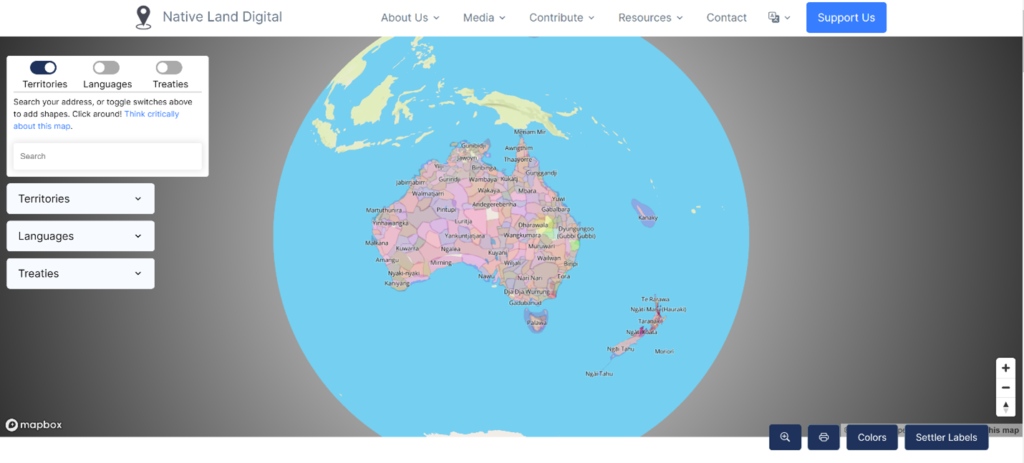
Native Land Digital is an interactive map of Indigenous territories, languages, and treaties that documents native lands across the globe but particularly in North & South America and in Australia. It is available on the web or as a smartphone app (iOS and Android). The app uses basic geolocation to retrieve information from the website.
The initial map, Native-Land.ca, was created in 2015 by Victor Temprano, a settler hailing from Okanagan territory in what most call Canada. Temprano writes that he began Native Land in late 2014 as a hobby project after attending pipeline protests and looking more into the traditional territories of different nations in relation to resource development. Cognizant of being a settler, Temprano reached out to the community of users for input and corrections to the map. Since, Native Land Digital has evolved into an Indigenous-led, not-for-profit organization that “strives to go beyond old ways of talking about Indigenous people and to develop a platform where Indigenous communities can represent themselves and their histories on their own terms.”
Native Land Digital shifts perspective each time you open it.
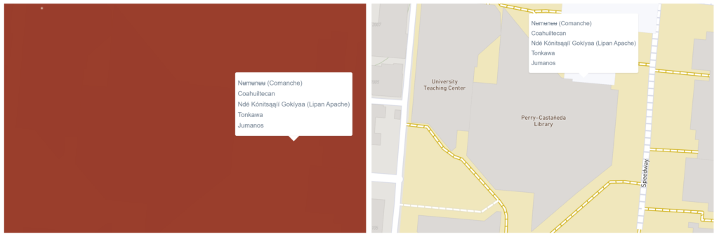
Before you are taken to the Native Land map, a pop-up disclaimer encourages further investigation and corrections. Once you click “Go To Map,” it loads without the clutter of borders and the labels we are used to seeing on political maps. Instead, layers of colorful polygons represent Indigenous territories over a basemap that emphasizes terrain. Type an address, zip code, or placename, and the map will show both present and historical Nations in the area. For example, type the address for the Perry‑Castañeda Library (PCL). You won’t see the unmistakable shape of the building with the labels you are accustomed to until you click the buttons on the bottom right-hand side of the map marked “Colors” and “Settler Labels.” The map shows that the PCL is on Jumanos, Tonkawa, Ndé Kónitsąąíí Gokíyaa (Lipan Apache), Coahuiltecan, and Nʉmʉnʉʉ Sookobitʉ (Comanche) land.
PCL obscured by polygon next to PCL with “Colors” off and “Settler Labels” on.
You can toggle or search territories, languages, and treaties on the left-hand side of the map. Also, there is an option to “Contact local nations to verify” with links to web pages for each Nation. You will find links to Nation’s website, related maps, images, sources, a changelog, and a form to share thoughts and corrections. This openness to improvements and amendments has led to many enhancements to the project and built a community of scholars and activists invested in the project. A former member of the Board of Directors began her relationship with the project by submitting a boundary correction, for example.
Native Land Digital goes beyond the map, territory, and treaty pages. Following a link that encourages you to “think critically about this map” takes you to the Teacher’s Guide page with a downloadable guide titled “The Land You Live On” and a Historical Primer written by Shauna Johnson, a member of the Board of Directors. The teaching guide introduces the project, explains how to use both the website and mobile application, introduces the concept of “Land as Pedagogy,” and provides exercises to engage students of all ages, including those that are intended for use outside the classroom. The Historical Primer is a concise essay that skillfully explains why this work is so important, namely colonization and the erasure of indigenous people and their relationship to land.
As Land Acknowledgments, or Territory Acknowledgements, have become a more common practice here at UT, Native Land Digital is an excellent tool for researching a location. The Territory Acknowledgements page can also help you explain the importance of acknowledgments to skeptical people and help yourself think beyond Land acknowledgments. The Next Steps section explains, “Territory acknowledgements are one small part of disrupting and dismantling colonial structures. You may also want to get in touch with local Indigenous nations or organizations to build relationships and support their work. Use our tools to find some contacts!”
Native Lands Digital is updated daily using a combination of technologies. WordPress, an open-source platform for self-publishing, is used to update map data, media, and links for each individual nation, language, or treaty page. Geospatial updates are then pushed to Mapbox, a tool for creating custom online maps, to update the map and associated API. Native Lands Digital API are free of copyright (CCO 1.0). Learn more about Native Land APIs from their blog post, Our Wonderful, Wily API.
Further reading about counter-cartographies, decolonizing the map, and Land as Pedagogy from these resources:
Every year the United States honors women and men who have served the U.S. armed forces during war and peacetime on the anniversary of the end of World War I, November 11. Originally called Armistice Day, Veterans Day celebrated and honored the soldiers that lost their lives in World War I. In 1954, after World War II and the Korean War, the federal holiday was officially expanded to celebrate and honor all veterans.
The UT Libraries honors veterans by telling their stories, preserving their legacy in our collections, and making the materials that meant something to them available to researchers for generations to come.
This Veterans Day, we are highlighting a collection of field maps and charts that belonged to Colonel Roland T. Fenton, a veteran of World War I and World War II. We are excited to tell part of his story through the maps he used in the field with an online exhibit, the Field Maps of Colonel Roland T. Fenton.
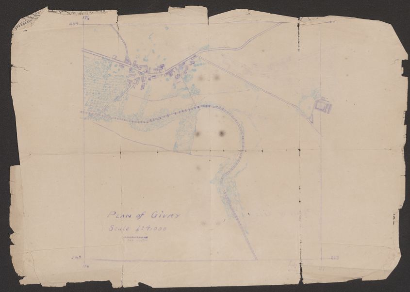
Plan of Givry: scale 1:4,000. “July [day illegible], 1918” This hand-drawn map from World War I shows built areas, a railway line, roads, and vegetation is the only manuscript in this collection.
Aside from some basic biographical information, we know very little about Col. Fenton. We know that he spent 28 years of his life serving in the U.S. Army, and in that time, he was infantry and infantry support in both World Wars. And he managed to preserve some essential tools of his deployment, his maps. The fact that these maps survived the treacheries of war is incredible. After Col. Fenton died, his family donated his military effects to the Army Heritage Center who offered UT Libraries the maps to fill in missing maps from our online Perry-Castañeda Library Map Collection. They exceed our expectations. The field printing and annotations alone make them exceptional, but also many were classified. We are fortunate to be able to preserve and share them with generations to come.
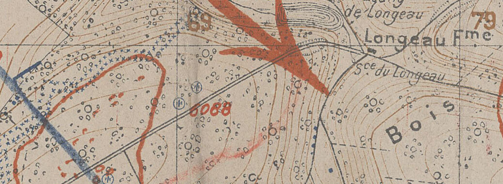
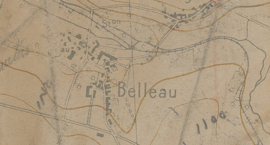
This detail of Château-Thierry: 29 Juin 1918 depicts Belleau, France. On July 18, 1918, (then) Lt. Fenton’s actions earned him the second-highest military decoration, the Distinguished Service Cross.
Visit the UT Libraries’ Exhibit to learn more about Col. Fenton and the context of his collection. The images accompanying this post and the exhibit are a fraction of the 84 maps in the Field Maps of Colonel Roland T. Fenton in the UT Libraries Collections portal.
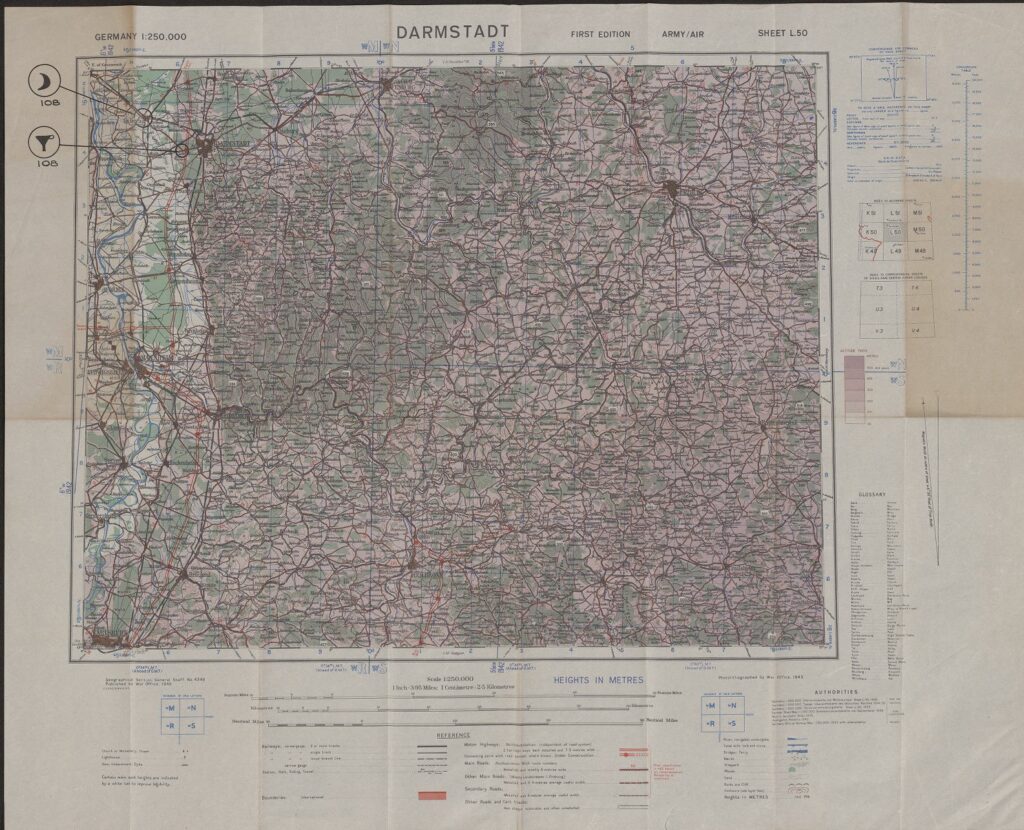
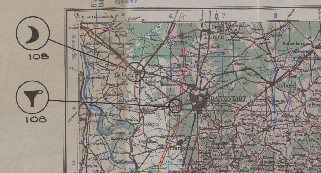
This copy of the Darmstadt map has two overprint annotations, one circle around Gr. Gerau [Groß-Gerau] northwest of Darmstadt, connected to a second circle in the upper left margin enclosing a solid black crescent symbol and one circle around Truppen-Übungspl. Southwest of Darmstadt with a line connected to a second circle in the upper left margin encircling a solid black symbol of a funnel with a handle. The symbols indicate classes of supplies.Detail of overprinted symbols representing supply classes; the crescent symbolizes Rations and the funnel symbolizes Petroleum, Oil, and Lubricants (POL).
Thirty five years ago, Dennis Trombatore arrived at the UT Austin campus, and from the start he was highly conscious of the long legacy of the Geology Library and that of the formidable librarians who had preceded him in the charge of that major collection. Despite feeling the strong gaze of Thelma Guion (https://guides.lib.utexas.edu/geo/about), the singular personality who ruled over the geology information sphere as librarian between 1940 and the early 1970s, Dennis jumped in, immersed himself, and never looked back.
A self-described “professional generalist,” Dennis was formally educated in philosophy, but quickly developed a natural affinity and deep appreciation for the esoterica of geosciences information: geological survey reports, rocks, gems and fossils, maps and field trip guides. He loved working closely with and learning from faculty and students in the Jackson School of Geosciences.
“A good library is a place to go, and a person to talk to, who understands what you’re doing, who sympathizes with your worldview, who talks your language, and who is looking out for you in the world of information all the time.”
Ever-curious and always ready to help, his definition of what a library, and a librarian, should be, epitomized Dennis’s approach to his work in the Walter Geology Library.
Several defining objectives consistently guided his efforts to amass and share a wealth of information about all of the things of interest to his faculty and students, community experts and generalists like himself. Those were collection-building, access to collections, and the relationships that served as the fuel for the continuously-enhanced cycle of learning and sharing that positioned Dennis as an information hub within the Jackson School for more than three decades.
Dennis’ collection-building, through relentless painstaking searches and world-wide acquisition efforts, coordination of gifts, and tracking of UT research output, was always front and center in his activities. Maps were an integral part of that work, and Dennis curated a truly exceptional collection of map materials in support of teaching and research in the geosciences, the Tobin International Geological Map Collection (https://guides.lib.utexas.edu/geo/tobin-maps). He led the effort to build on UT’s existing map collections, through the acquisition of geospatial data sets, GIS technology, and the expertise to fully utilize the details therein. And he was a tireless advocate for and user of the UT Libraries renowned PCL Map Collection (https://texlibris.lib.utexas.edu/2015/05/22/you-are-everywhere-the-pcl-map-collection/). His understanding of the power and value of maps was evident not just in his efforts to build the Libraries collections, but even in references to maps in his own creative output (https://repositories.lib.utexas.edu/handle/2152/82153) which in turn was shared openly with the world using the Libraries’ repository infrastructure.
Ensuring access to what he curated was key for Dennis. His strong desire to make the rich, multi-faceted fruits of his collection-building work discoverable prompted his early interest in web-based tools to ensure the discoverability and preservation of his efforts, including Texas ScholarWorks (TSW), our digital repository, our Texas Data Repository (TDR), and our nascent Texas GeoData portal.
Our Head of Scholarly Communications, Colleen Lyon, recalls that, “Dennis was instrumental in so many collections in TSW – he was one of the most active liaisons in referring users to us.” Several stand-out examples of unique submissions for Colleen include:
Memoirs on the Extinct Wingless Birds of New Zealand. It may have existed as HTML on the Walter Geology Library website, but she remembers, “Dennis wanted it to have a more permanent home and one that was easier to cite. He didn’t want to lose all the functionality that comes with having something as a website, so we uploaded all the pages/images and then created an image index that allows you to jump around to the different images (plates) within the work. This work has the most amazing drawings in it! That plate index has had over 1100 downloads.” You can see this in TSW at: https://repositories.lib.utexas.edu/handle/2152/16251
The Virtual Landscapes Collection. This collection of Dumble Survey reports and many other documents was Dennis’ labor of love over many years. The content was migrated from the UT Libraries legacy website to TSW earlier this year, bringing all of the related documents together in a single location. Read more at: https://repositories.lib.utexas.edu/handle/2152/69304
Another project that Dennis coordinated was the digitization of theses and dissertations. He sought out alumni to grant permission to digitize their master’s and doctoral theses and make them available through TSW. Thanks to his efforts, there are hundreds of geology theses in the repository, about half of which pre-date its launch in 2008 (https://texlibris.lib.utexas.edu/2018/09/26/happy-10th-birthday-texas-scholarworks/). Rather fittingly, quite a few of the theses and dissertations available in TSW include Dennis’s name in their acknowledgements sections, along with their authors’ heartfelt expressions of gratitude and appreciation for the guidance and assistance he had provided. One such acknowledgement aptly describes Dennis as someone “whose work and efforts are immeasurable and irreplaceable” – a statement which accurately captures the value of his contributions and the strength of the impression he left on others.
Dennis delighted in telling stories and connecting people via the relationships he fostered, all of which enriched his contributions to UT’s research ecosystem. Mentoring students, both those doing research and those who were employees, was an ongoing part of who Dennis was, the role he played in the Jackson School, and how he remained in contact with so many graduates over the years. He was the type of person who would be proactive in reaching out to someone new on campus to welcome them, who would find a way to rearrange his schedule so that he could travel across town to attend a colleague’s presentation. His sincere enthusiasm for sharing knowledge and building real connections with others across the university community and beyond, was clearly evident in both his actions and words.
“The collection is an important component of what it is that we do in libraries, but it is the social network that the library represents that is the most significant, to me, aspect of librarianship. Three or four good people can do a lot more than an empty roomful of books in terms of helping people to advance their research.”
Some of his stories were about former Geology Librarian Thelma Guion’s stern demeanor and soft spot for the many student employees whom she supervised. (https://guides.lib.utexas.edu/geo/about) The irony there is the similarity between Thelma and Dennis: while he suffered no fools, Dennis was always open to teaching his students about things and providing them with resources that would help them both with their research and in life. Establishing the Guion award fund for Geology Library employees was one of Dennis’ proudest achievements.
Ms. Guion’s close relationship to many faculty helped to expand and deepen the library’s collection in ways that would simply not have been possible with regular budgets, and Dennis modeled his collection philosophy after hers. Those relationships paid off in major gifts of unique and valuable materials for many years.
One such recent gift was from a prominent member of the local caving community, Bill Mixon — former book review editor for the National Speleological Society and friend of the Walter Library — who donated his unique collection of over 1000 books and more than 1000 periodical issues related to cave and karst research, literature, and culture, enhancing the Geology Library’s notable existing holdings (https://texlibris.lib.utexas.edu/2019/02/21/area-spelunker-donates-cave-collection/).
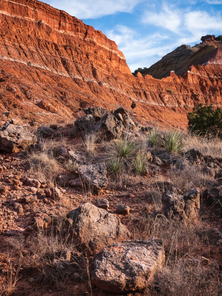
Palo Duro Canyon State Park in the Texas Panhandle. Photo by Raychel Sanner.
Over the years, gifts of materials included items from major oil company libraries, UNOCAL maps, materials from the American Geosciences Institute, Bureau of Economic Geology and Institute for Geophysics, and the Edwards Aquifer Authority in San Antonio, to name a few. All donations of materials required careful review and curation, as Dennis only retained items to augment areas of focus within the Walter Geology Library and research interest at UT Austin.
The symbiotic, reciprocal relationship between collections and the people who use, learn from and contribute to them often needs a catalyst, someone to prompt attention, encourage exploration and entice action at just the right moment. Dennis was that energetic, compelling force that spurred the dynamic flow of information to nurture productivity throughout the Jackson School, and that will continue to pulse through electronic arteries for decades to come.
Read, hot & digitized: Librarians and the digital scholarship they love— In this series, librarians from UTL’s Arts, Humanities and Global Studies Engagement Team briefly present, explore and critique existing examples of digital scholarship.
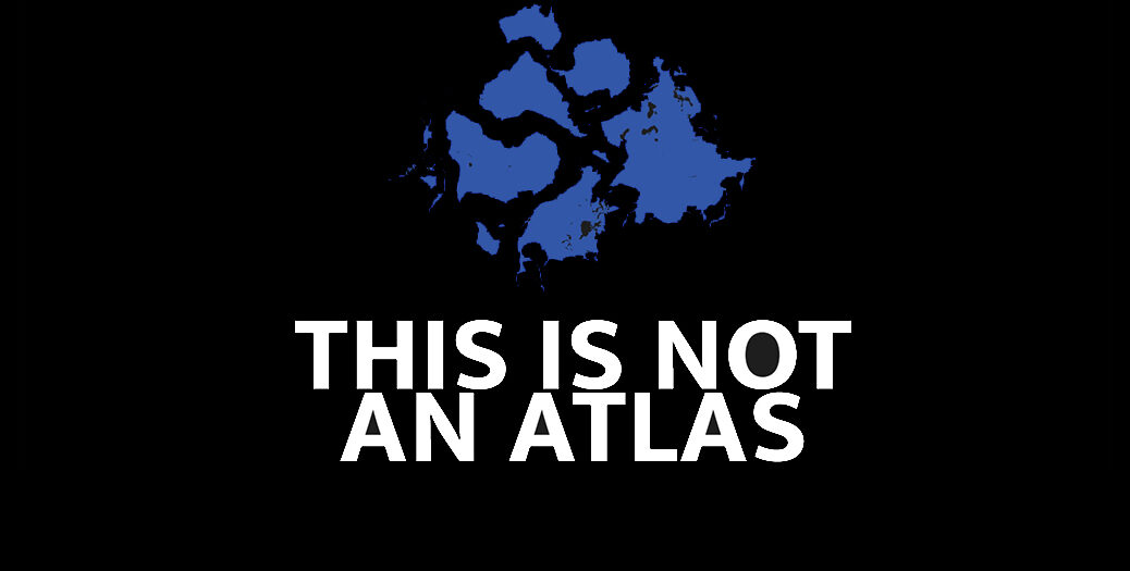
This Is Not an Atlas is a continuation of a book of the same name, subtitled “A Global Collection of Counter-Cartographies.” Critical geography proposes that maps are never neutral, but rather reflect views of the map maker, often those in power. Counter-mapping, or creating counter-cartographies, refers to the use of maps to reframe the world in such a way as to challenge dominant power structures and to articulate alternative, progressive and even radical interests (Kitchin, et al., 2011).
In the spring of 2015, kollektiv
orangotango, a self-described network of critical geographers,
friends, and activists who deal with questions regarding space, power, and
resistance, sent out a call for maps in English, German and Spanish.
Overwhelmed by the response and realizing that many of the maps submitted are
dynamic, they decided to create a website to, not only highlight projects from
the print edition, but also to “continue to share maps, struggles, projects,
texts, and inspirations online.” Here I highlight a counter-mapping project
that successfully deals with the politics of in/visibility, as described
in Emancipatory Mapmaking: Lessons
from Kibera.
Map Kibera was initiated after a group of
geographers attending a mapping conference in Nairobi, Kenya noticed that
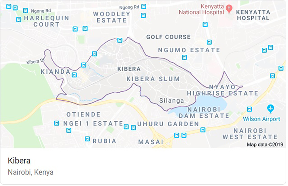
Kibera, one of Africa’s largest informal settlements, was not mapped. In fact,
they discovered that authorities had labeled and designated the Kibera Slum as
a forest. How could a community with an estimated population of 250,000 people
be omitted from official maps of Nairobi? Two geographers who were also
interested in open source mapping decided they wanted to change this. In
October 2009, Mikel Maron and Erica Hagen started the Map Kibera project to
address “the glaring omission of roughly a quarter-million of Nairobi’s
inhabitants from mass communications and city representation and policy
decisions” (Hagen, 2011).
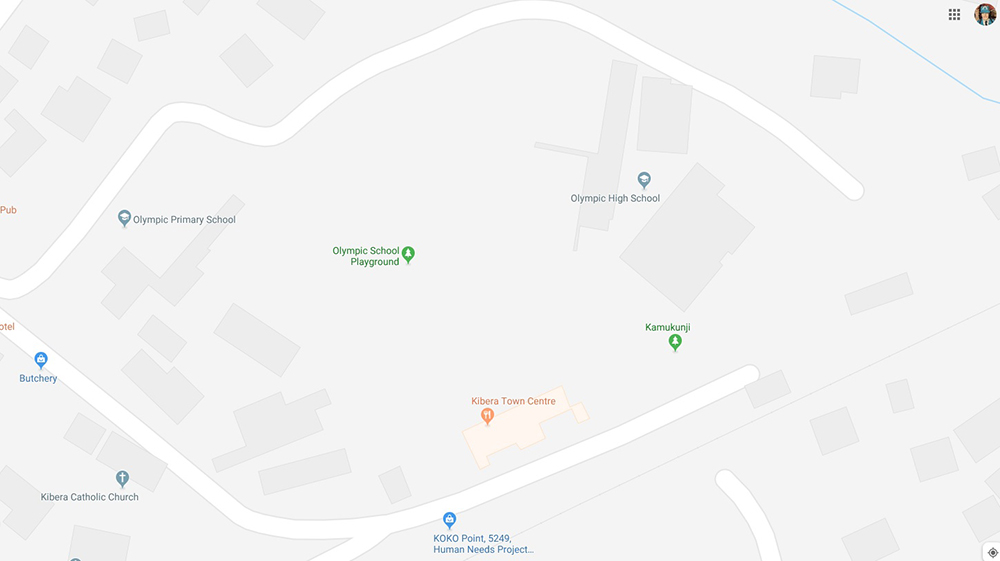
Current (09/09/2019) image of Kibera in Google Maps. Detail view of Kibera in Google Maps yields little detail about the community.
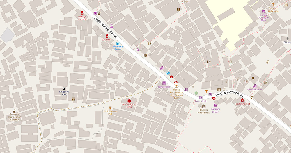
Kibera is too densely populated to rely on satellite data
for mapping. Maron and Hagan knew they would need to map it from the ground.
They recruited a dozen young residents to be “mappers,” gave them GPS devices,
and sent them to collect data by creating “traces,” a GPS-enabled process that
tracks and records your physical location. The mappers interviewed residents
and collected observational data, such as the names of clinics, schools, and
businesses, locations of water pumps, public baths, and other “points of
interest” along their routes as well. The team then added the data to OpenStreetMap (OSM),
a crowdsourced world map that relies on user-generated content to create
geographic data that is relevant and available to everyone. And within three
weeks they had created an incredibly dense map of Kibera for the world to see. But
more importantly, a map of Kibera that was extremely useful to residents.
Kibera in OpenStreetMap (09/09/2019)
The project did not stop there; they immediately created,
printed, and distributed maps of clinics and schools within the community. And
a security map of Kibera warning of areas to avoid and illustrating places to
get help. And have since formed the Map Kibera Trust,
created the Voice of Kibera, a platform for citizen
reporting, and replicated their model in other marginalized communities in
Nairobi.
The book is as beautiful as the website;
visit the UT Libraries to see it in person. If you’re interested in learning
more about critical geography and counter-mapping, I highly recommend Rethinking the Power of Maps and the Map Reader. Map Kibera initiators, Erica Hagen,
and Mikel Maron later founded the Ground Truth Initiative.
Visit their project page to
find out about other counter-mapping projects they are working with, such
as Grassroots Jerusalem.
In the same way that the internet and digitization have created new ways to make books more discoverable and facilitated new ways of exploring text, so, too, have they opened avenues for a greater exploration of maps and their underlying data.
As what has been a deliberative process, the UT Libraries have tended toward later adoption of new currents in libraries and librarianship in order to take advantage of the trial and error mechanics that so often are part of embracing untested technologies and frameworks. Geographic information systems (GIS) technology has been in the ascendant for several years now as a burgeoning area of expertise in libraries, and with the expansive cartographic resources we have at UT and the evolution in the growth of local datasets, it was time for the Libraries to embrace GIS as part of its overall strategic expertise.
Geospatial data identifies data that has a geographic component to it…any data that includes locational information – such as coordinates (latitudes and longitudes), addresses, cities, zip codes, etc. – and can be applied to some position on the Earth. We rely on geospatial data to track weather, find the best route to a destination, manage air traffic, make decisions about where to invest in infrastructure projects and to determine how best to deploy marketing resources. And all of these data forms can be mapped. GIS helps to organize and visualize that data in ways that make it eminently more useful.
The Libraries finally entered the landscape of GIS last year with the hiring of Geospatial Data Coordinator Michael Shensky, and a major undertaking in his short tenure has been to spearhead the development of an interface that will facilitate discovery of the cartographic resources and geospatial datasets in our collections by researchers, faculty and other university constituents.
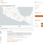
Texas GeoData Portal.
The Texas GeoData Portal uses an open source geospatial discovery application – GeoBlacklight – to power a web portal that gives users the ability to search, browse, preview, and download geospatial datasets. Visitors to the website will be able to search through a variety of geospatial datasets, including georeferenced scanned map images from the PCL Maps Collection and vector datasets developed from items in other special collections like the Benson Latin American Collection and Alexander Architectural Archives.
The portal will allow users to download data in several different standard geospatial formats so that they can easily be loaded into GIS software for advanced visualization and analysis.
Texas GeoData Portal.
Texas GeoData Portal.
Coordinated use of GeoBlacklight software and collaboration through the OpenGeoMetadata project has created a community among partner institutions for the sharing and standardization of data and metadata, expanding the opportunities for discovery and creating a robust search functionality among a large corpus of resources. Users can filter search results based on various dataset characteristics including geographic extent, subject matter, institution, data type, and format.
“I’m really excited to be a part of this project because I know this portal has the potential to benefit everyone in the campus community regardless of their role and area of specialization,” says Shensky. “Faculty can use the portal to find data for developing instructional materials, students can find data to use in research projects, and visitors will have access to a variety of unique maps and datasets that they can explore.”
The Texas GeoData Portal is in the closing stages of development with a full launch expected later in the fall, at which point users will be able to access the new resource through the Libraries’ website. Already discussions are underway regarding future functionality, which could include UT single sign on authentication for viewing license-restricted data, integration with the unified search on the Libraries’ website and integration with the Texas Data Repository and the Collections portal (more information to come on this project).