Read, hot & digitized: Librarians and the digital scholarship they love — In this series, librarians from the UT Libraries Arts, Humanities and Global Studies Engagement Team briefly present, explore and critique existing examples of digital scholarship. Our hope is that these monthly reviews will inspire critical reflection of, and future creative contributions to, the growing fields of digital scholarship.
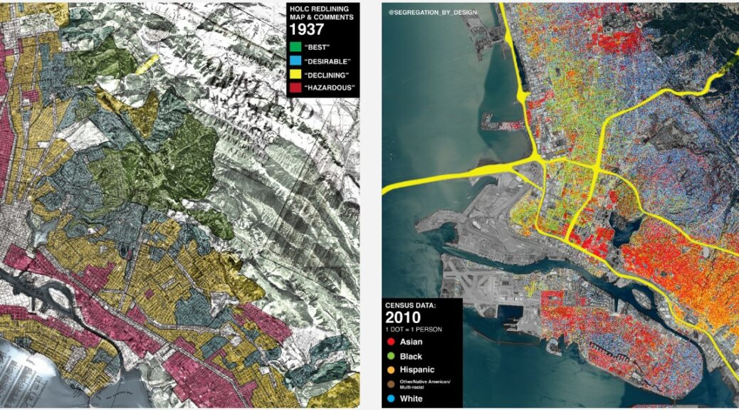
Segregation By Design is a compelling personal project by Adam Paul Susaneck, an architect based in New York City. Through spatial analysis, demographic data, historical photos, and extensive research, Susaneck effectively illustrates “how the American city was methodically hollowed out based on race.” It offers an insightful perspective on an important issue that has shaped the country’s history and continues to impact its present. The project’s goal is threefold: to create a print “Atlas of Urban Renewal,” to create digital materials for local groups opposing ongoing freeway expansion, and to raise awareness through social media.
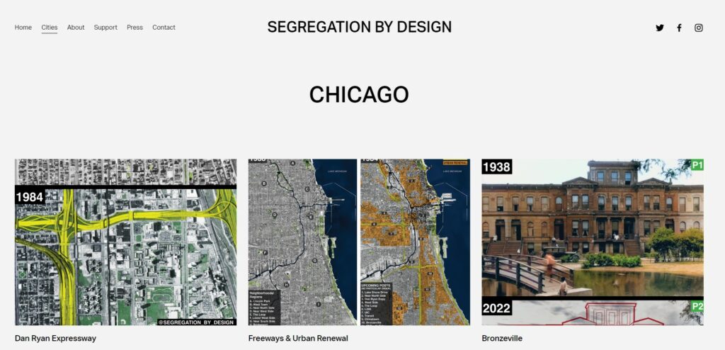
The website offers a preview of what the print atlas will look like. 180 municipalities that received federal funding from the 1956 Federal Highway Act have been analyzed, and so far, there are 14 cities profiled. Each city has multiple sections, such as “Freeways & Urban Renewal,” “Redlining,” and “Transit.” Focus is given to specific highways, neighborhoods, environmental impacts, or buildings.
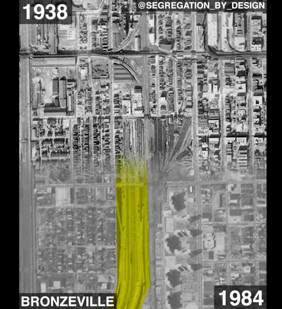
For example, the “Chicago: Dan Ryan Expressway (I-90)” section includes an animated swipe map juxtaposing aerial photos from 1938 and 1984 illustrating the “path of destruction” and displacement when the I-90 highway was built in the 1960s. It explains that over 81,000 people, many of whom were BIPOC or recent immigrants, were displaced.
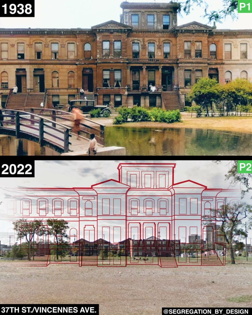
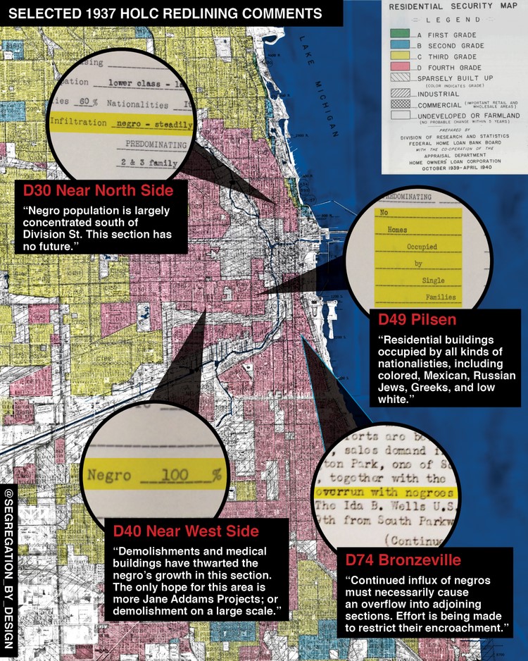
Likewise, the “Chicago: Bronzeville” section profiles a neighborhood decimated by “urban renewal.” Before and after photos of buildings are combined with Susaneck’s transposed line drawings of buildings over present-day photos, masterfully visualizing and mapping redlining of the area.
Redlining is a discriminatory practice that systematically denies services such as mortgages, insurance loans, and other financial services to specific area residents based on race or ethnicity.
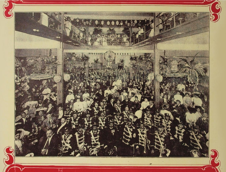
Yet another section, “Chicago: Pekin Theater,” focuses on the first black-owned theater in the United States, which was appropriated by the city through eminent domain, a process that left large swaths of the neighborhood cleared for “urban renewal.” The lot has been vacant since 1940.
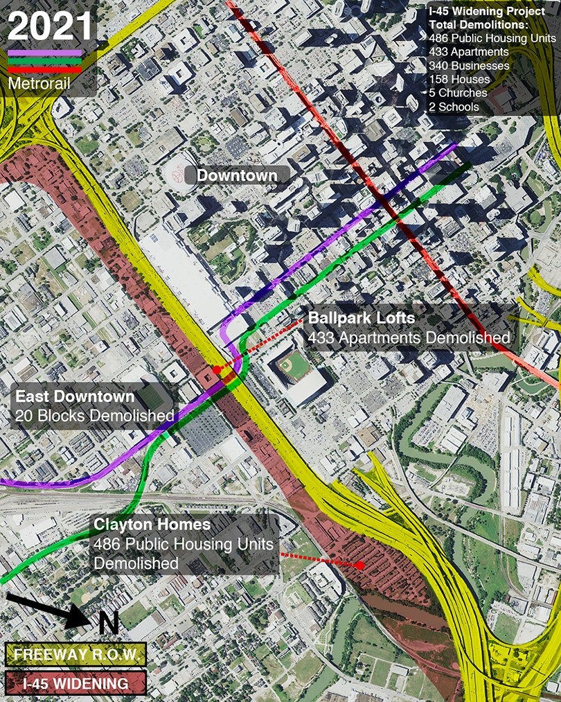
The project’s second goal is to create digital materials for local groups opposing ongoing freeway expansion. Susaneck states, “As state governments continue to mindlessly widen freeways, community groups in cities across the country have formed in opposition. This project aims to support these groups by creating easily digestible graphics to spread awareness.” One such project is Stop TxDOT I-45 in Houston, Texas. Their mission is “to challenge the status quo of transportation policy and to fight for all people in Houston to be able to participate in the decisions that affect health, safety, and mobility in their communities.” Similarly, the “Houston: Flooding” section of Segregation By Design discusses the environmental impact of highways and urban sprawl and how nonwhite residents are disproportionately affected by natural disasters.
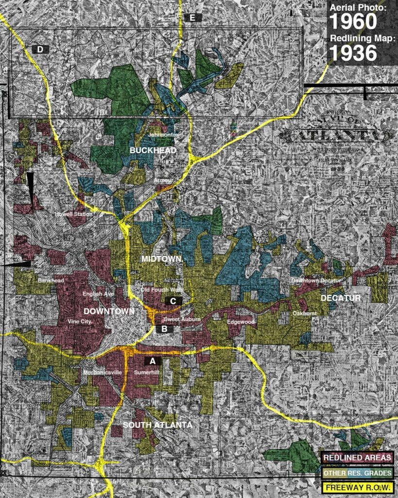
Susaneck is accomplishing his third project objective of raising awareness through social media. In fact, Segregation By Design first caught my eye with an Instagram post that highlighted a striking map of Atlanta followed by bird’s-eye images of highway construction clearance from 1956 to 1990. The caption is lengthy for Instagram but is engaging. Susaneck describes the images in it: “The first image shows the freeway right of way overlaid on the 1936 HOLC redlining map and a 1960 aerial photo. The subsequent images show the destruction wrought by freeway construction.” Susaneck then explains who was affected by the highway construction, gives the names of neighborhoods decimated, and expounds on the history of redlining. Instagram lends itself to the graphic nature of his work, the dynamic swipe maps (often used to illustrate before and after destructive events), then-and-now comparisons, and augmented photos highlighting the significance of buildings as well as homes and communities that have been demolished.
For readers not on Instagram who still want updates, you can sign up to receive new entries via email, including high-resolution images and maps. Supporters can contribute to this largely self-funded project through the subscription-based platform Patreon.
Segregation By Design uses engaging infographics and directness to help explain the complicated policies contributing to systemic racism in our country. It’s invaluable in making these issues more manageable and understandable. I look forward to adding the Atlas of Urban Renewal print version to the Perry-Castañeda Library (PCL) Map Collection.
Books highlighted on Segregation By Design:
Rothstein, Richard. The Color of Law: a Forgotten History of How Our Government Segregated America. Liveright Publishing Corporation, 2017.
McGhee, Heather. The Sum of Us: What Racism Costs Everyone and How We Can Prosper Together. One World, 2021.
Seo, Sarah A. Policing the Open Road: How Cars Transformed American Freedom. Harvard University Press, 2019.
Fullilove, Mindy Thompson. Root Shock: How Tearing up City Neighborhoods Hurts America, and What We Can Do About It. New Village Press, 2016.
Connolly, N. D. B. A World More Concrete: Real Estate and the Remaking of Jim Crow South Florida. The University of Chicago Press, 2014.
Other suggested reading:
American Panorama: An Atlas of United States History – Susaneck cites this digital project from the Digital Scholarship Lab at the University of Richmond throughout his works.
Red, Hot, and Digitized: New Website Maps Discriminatory Redlining Practices – an earlier Read, Hot, and Digitized post about Mapping Inequity from the American Panorama.

