Category Archives: Behind the Numbers

Keeping Tabs on Campus Trends

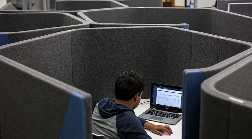
The only constant is change, as the old saying goes. As technological and social change affect how we interact and engage with one another, it’s critical that libraries continually seek information about the evolving expectations of our community. Observations and usage trends provide valuable data that help orient our direction, but sometimes the best way to surface user expectations is to just ask

At the end of February, the Libraries launched a campus-wide survey to a random sample of students, faculty, and—for the first time—staff. If you happened to be among those who received an invitation and responded, we offer our thanks. If you didn’t get an invite, maybe we’ll catch you next time. The Libraries typically undertake a survey every 2 or 3 years to make sure we’re keeping tabs on how we are doing—it’s a great way to see what’s working well, what we might consider changing and in some cases, what we might stop doing. 

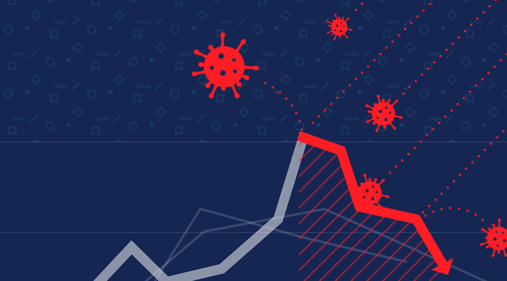
The 2022 survey is particularly important because it is the Libraries’ first survey since prior to the pandemic. The original plan was to implement the survey in fall 2020, but things felt too different, too anomalous at that time to get an accurate picture. Many of us were not on campus, and many of our circumstances were strained or unusual. We wanted the survey to represent longer-term trends—inasmuch as those exist anymore—rather than a snapshot of perceptions during the campus’s most restrictive COVID-related policies. The last time we surveyed the campus was in spring 2018, so there’s an eagerness to see what has changed and what has stayed the same over the last four turbulent years. 

For the first time, we developed and wrote our own survey instrument. This has long been a goal of mine, not because there aren’t great survey instruments available to libraries, but because we wanted to be able to tailor our questions to our unique population and circumstances. Past industry-standard instruments that we’ve used such as those created by LibQUAL and Ithaka S+R allowed us to compare trends at UT to national trends—which is a valuable exercise—but this time we wanted to focus on the perceptions, experiences, and needs of the Longhorn community. With support from folks around campus (especially the staff in IRRIS) and a seasoned assessment team, we took on the challenge of writing, administering, and analyzing our own survey, designed to provide us with actionable feedback. 

In the coming months, we’ll be using this space to share some of the findings from the survey as we work through our analysis, and eventually, we will have full results to share with the public. Topics that you can expect to see addressed here include longitudinal insights (i.e., where we see trends and perceptions evolving over the long term), spotlights on insights gleaned about different demographic groups, and other interesting tidbits. We won’t just tell you what we find interesting, though—we want to highlight what we’re doing with the results. Expect to read about areas that we want to investigate further with focus groups and interviews, and changes that we’re putting in place based on what we learn. 
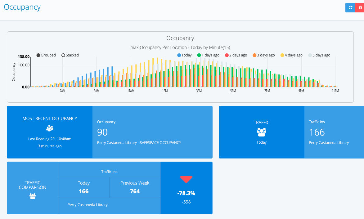
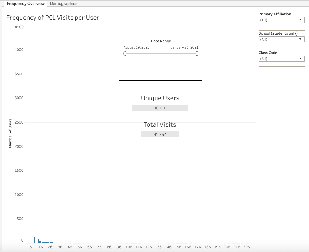
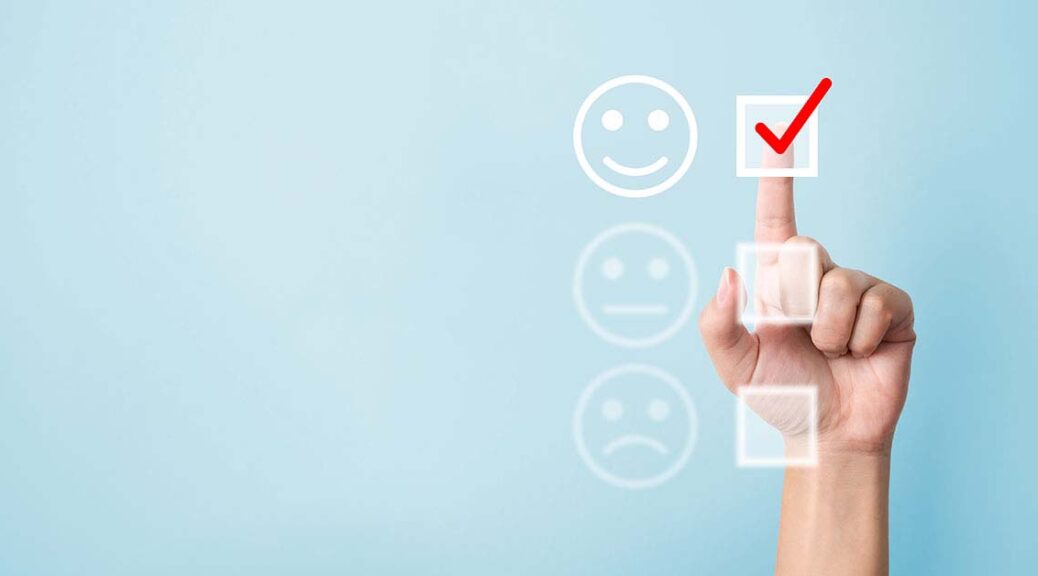
A sneak peak of a survey item focused on satisfaction shows that for the most part, folks are pretty happy with us…in particular, happy with the Libraries’ services.  But there is more still to be learned from a thorough review of the data:

  • Does that hold true across all demographic groups?  
  • What can we learn about those who aren’t satisfied?  

These are the kinds of questions we’ll be asking ourselves and our users, as we sift through the results. We invite you participate in an ongoing exploration of the data we’ve collected so that we can learn even more from the process of analysis as we seek to improve the work of these Libraries.  

The Libraries’ roadmap for success depends largely on hearing both the praise and criticism of our users, so take an opportunity to help improve your UT Libraries by providing your own input, feedback and observations as we plan together for the best possible future. 

Behind the Numbers: UX

This post will focus on how the Assessment Team has begun officially dipping our toes into User Experience (UX) research by conducting a usability test focused on part of the main navigation of the UT Libraires website. Why, you might ask, is this assessment-focused column talking about UX?

In many ways, my assessment practice has always incorporated a good bit of user experience work, though I haven’t typically labeled it as such. Past endeavors such as dot poster surveys (used to learn how students were using new library spaces) and a branch observation project (that was interrupted by the pandemic) employed user experience methodologies, and I see user experience and assessment as complementary and overlapping approaches to asking and answering questions aimed at improving what we do.

When the Libraries redesigned our website a few years ago (which was a huge accomplishment involving many of my talented colleagues), the site redesign process incorporated user feedback by conducting A/B tests, usability tests, focus groups, and more. Now that the site has moved out of development and into sustainment, there are fewer resources devoted to conducting user tests. My colleagues have been busy producing great new tools like portals for our digital exhibits, our digitized and born-digital items, and geospatial data, but we were not sure how to best incorporate them into our site navigation. Members of the Web Steering CFT have conducted user tests as needed/possible, and the Assessment Team decided to help in the effort and take on a UX project this spring to help answer questions we had about our navigation menu choices.

A screenshot of the "Find, Borrow, Request" menu that includes links to Library Catalog, Articles, Databases, Journals, Course Materials, Collections Showcase, Digital Collections, Digital Exhibits, Maps, and Geospatial Data.

Along with a small team of other colleagues, we designed a series of questions and tasks focused on the “Find, Borrow, Request” portion of our website and recruited 10 students to participate in brief UX tests conducted through Zoom. While the pandemic has made many aspects of user research more difficult, we were easily able to recruit students through an email invitation, and were overwhelmed with the volume of interest we garnered. We just finished conducting tests earlier this week and haven’t analyzed the results yet, but I already learned through my role in conducting tests that terms like “Collections Showcase” and “Digital Exhibits” are not self-explanatory to the majority of our students. Most surprisingly, the label “Maps” (which we did not expect to be confusing) was misleading to most of the students I conducted or observed tests with. Students generally expected to find a map of library locations or library floorplans at the link, but the link actually leads to our collection of digitized maps of places all over the world. This underscores the importance of conducting frequent user testing. We never would have learned that “Maps” was confusing if we hadn’t been testing adjacent links! Clearly we need to rethink our labels.

I’m excited to analyze the full results and turn them into recommendations for improving the site. I’ve even more excited about expanding our team to include a librarian focused on UX so we can increase our ability to conduct tests like this. We just posted a position for a UX Librarian to join the Assessment and Communication Team to help us ensure that our spaces and services (both web and physical) are welcoming and functional for our users. The eventual end of the pandemic provides ample opportunity for rethinking how we have always done things, and we hope that a UX Librarian will help ensure that the changes we make help our users have great experiences at the UT Libraries.

Behind the numbers: pandemic metrics

When I tell people that my job is to do assessment for an academic library, it’s not uncommon to see a brief blank stare, followed by a story about a library that made an impact on them. People know and love libraries. Assessment? Not so much. This new blog series, Behind the Numbers, will show examples and tell stories about how we use assessment at the UT Libraries to help give our users those impactful library moments.

Because it’s at the forefront of everything at the moment, I will use this inaugural post of Behind the Numbers to delve into how we’ve used assessment to help navigate the disruption to our spaces and services caused by the pandemic. When the University moved all operations online in March 2020 and we quickly changed all of our service models to a fully remote configuration, we needed a way to monitor how students, faculty, and staff were using online library services. As the pandemic continued into the Fall semester, we needed to make difficult decisions that involved limiting access to physical materials in order to retain special emergency access to those materials in digital formats through a partnership with other academic libraries called HathiTrust.

Faced with a difficult balancing act between the need to provide access to materials, spaces, and in-person support, and the need to keep our staff and community safe, we turned to available data to inform our planning. We built a basic dashboard with monthly metrics on the use of a few services that we thought might be helpful for making decisions about our physical spaces, in come cases comparing use in 2020 to use before the pandemic. The dashboard is not comprehensive of all of our services, or even our most popular services. We chose to include data points that were quickly attainable and might help us make decisions about “re-opening” physical spaces in Fall 2020.

Of note here is the line chart in the top right that compares daily usage of physical items and the digital items we’re receiving through the special HathiTrust agreement. It shows us that in general, use of the HathiTrust digital items has been on par with usage of physical library materials.

After a period of operating as an online only library, we reopened the main library with limited services and spaces and serious COVID precautions in place. We needed a way to measure safe capacity in our space to allow for adequate social distancing, so we implemented a people counter and a swipe to enter system. The people counter has software built in that allows us to monitor occupancy at any moment and look for patterns of occupancy. We have used this to make decisions about how much of the main library to make available. Through the fall semester, we learned that the main floor of PCL is large enough to safely hold all library visitors even at peak usage times.

Beyond occupancy, we wanted to know about the people who were using the physical library space. Were they students? Faculty? Were they coming often to study, or just occasionally to borrow materials? As part of a mixed methods study, we used swipe data to create visualizations that tell us how many times each unique visitor entered PCL. As you can see below, over half of the people who have visited since we reopened in Fall 2020 have only visited one or two times, suggesting that they were there to fulfill a specific need, not to study or attend classes online. We also monitor the university affiliations of our visitors, showing that the vast majority are students.

We also invited everyone who visited PCL during the Fall semester to respond to a survey with questions about perceived safety and suggestions for the Spring. We were thrilled to learn that almost 90% of survey respondents reported feeling very safe or extremely safe at PCL. This gave us further confidence that our occupancy data was helping us make good decisions.

The Assessment Team had been thinking before the pandemic about what data we might include in dynamic dashboards to help our colleagues make data-driven decisions, but COVID-19 pushed us in that direction more quickly than we planned. Stay tuned for more dashboards (and info about other methods) in posts to come.