
When I tell people that my job is to do assessment for an academic library, it’s not uncommon to see a brief blank stare, followed by a story about a library that made an impact on them. People know and love libraries. Assessment? Not so much. This new blog series, Behind the Numbers, will show examples and tell stories about how we use assessment at the UT Libraries to help give our users those impactful library moments.
Because it’s at the forefront of everything at the moment, I will use this inaugural post of Behind the Numbers to delve into how we’ve used assessment to help navigate the disruption to our spaces and services caused by the pandemic. When the University moved all operations online in March 2020 and we quickly changed all of our service models to a fully remote configuration, we needed a way to monitor how students, faculty, and staff were using online library services. As the pandemic continued into the Fall semester, we needed to make difficult decisions that involved limiting access to physical materials in order to retain special emergency access to those materials in digital formats through a partnership with other academic libraries called HathiTrust.
Faced with a difficult balancing act between the need to provide access to materials, spaces, and in-person support, and the need to keep our staff and community safe, we turned to available data to inform our planning. We built a basic dashboard with monthly metrics on the use of a few services that we thought might be helpful for making decisions about our physical spaces, in come cases comparing use in 2020 to use before the pandemic. The dashboard is not comprehensive of all of our services, or even our most popular services. We chose to include data points that were quickly attainable and might help us make decisions about “re-opening” physical spaces in Fall 2020.
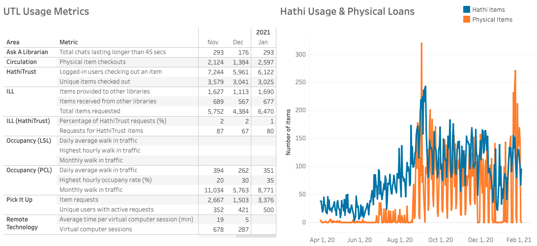
https://iq-analytics.austin.utexas.edu/#/views/Fall2020UTLUsageMetrics/UsageMetrics?:iid=1
Of note here is the line chart in the top right that compares daily usage of physical items and the digital items we’re receiving through the special HathiTrust agreement. It shows us that in general, use of the HathiTrust digital items has been on par with usage of physical library materials.
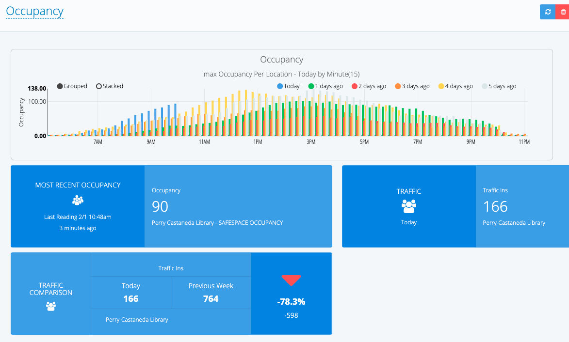
After a period of operating as an online only library, we reopened the main library with limited services and spaces and serious COVID precautions in place. We needed a way to measure safe capacity in our space to allow for adequate social distancing, so we implemented a people counter and a swipe to enter system. The people counter has software built in that allows us to monitor occupancy at any moment and look for patterns of occupancy. We have used this to make decisions about how much of the main library to make available. Through the fall semester, we learned that the main floor of PCL is large enough to safely hold all library visitors even at peak usage times.
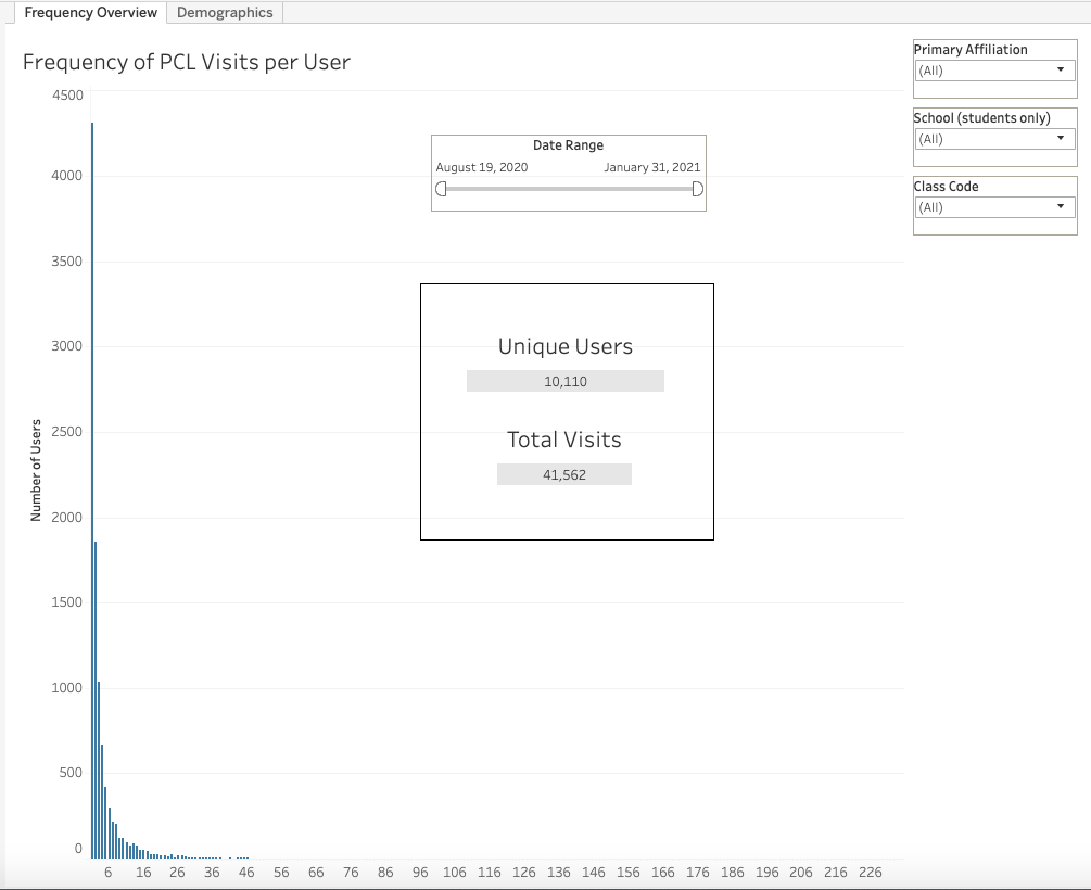
Beyond occupancy, we wanted to know about the people who were using the physical library space. Were they students? Faculty? Were they coming often to study, or just occasionally to borrow materials? As part of a mixed methods study, we used swipe data to create visualizations that tell us how many times each unique visitor entered PCL. As you can see below, over half of the people who have visited since we reopened in Fall 2020 have only visited one or two times, suggesting that they were there to fulfill a specific need, not to study or attend classes online. We also monitor the university affiliations of our visitors, showing that the vast majority are students.
We also invited everyone who visited PCL during the Fall semester to respond to a survey with questions about perceived safety and suggestions for the Spring. We were thrilled to learn that almost 90% of survey respondents reported feeling very safe or extremely safe at PCL. This gave us further confidence that our occupancy data was helping us make good decisions.
The Assessment Team had been thinking before the pandemic about what data we might include in dynamic dashboards to help our colleagues make data-driven decisions, but COVID-19 pushed us in that direction more quickly than we planned. Stay tuned for more dashboards (and info about other methods) in posts to come.