This post will focus on how the Assessment Team has begun officially dipping our toes into User Experience (UX) research by conducting a usability test focused on part of the main navigation of the UT Libraires website. Why, you might ask, is this assessment-focused column talking about UX?
In many ways, my assessment practice has always incorporated a good bit of user experience work, though I haven’t typically labeled it as such. Past endeavors such as dot poster surveys (used to learn how students were using new library spaces) and a branch observation project (that was interrupted by the pandemic) employed user experience methodologies, and I see user experience and assessment as complementary and overlapping approaches to asking and answering questions aimed at improving what we do.
When the Libraries redesigned our website a few years ago (which was a huge accomplishment involving many of my talented colleagues), the site redesign process incorporated user feedback by conducting A/B tests, usability tests, focus groups, and more. Now that the site has moved out of development and into sustainment, there are fewer resources devoted to conducting user tests. My colleagues have been busy producing great new tools like portals for our digital exhibits, our digitized and born-digital items, and geospatial data, but we were not sure how to best incorporate them into our site navigation. Members of the Web Steering CFT have conducted user tests as needed/possible, and the Assessment Team decided to help in the effort and take on a UX project this spring to help answer questions we had about our navigation menu choices.
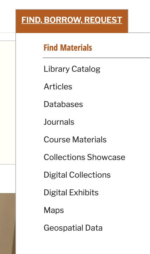
Along with a small team of other colleagues, we designed a series of questions and tasks focused on the “Find, Borrow, Request” portion of our website and recruited 10 students to participate in brief UX tests conducted through Zoom. While the pandemic has made many aspects of user research more difficult, we were easily able to recruit students through an email invitation, and were overwhelmed with the volume of interest we garnered. We just finished conducting tests earlier this week and haven’t analyzed the results yet, but I already learned through my role in conducting tests that terms like “Collections Showcase” and “Digital Exhibits” are not self-explanatory to the majority of our students. Most surprisingly, the label “Maps” (which we did not expect to be confusing) was misleading to most of the students I conducted or observed tests with. Students generally expected to find a map of library locations or library floorplans at the link, but the link actually leads to our collection of digitized maps of places all over the world. This underscores the importance of conducting frequent user testing. We never would have learned that “Maps” was confusing if we hadn’t been testing adjacent links! Clearly we need to rethink our labels.
I’m excited to analyze the full results and turn them into recommendations for improving the site. I’ve even more excited about expanding our team to include a librarian focused on UX so we can increase our ability to conduct tests like this. We just posted a position for a UX Librarian to join the Assessment and Communication Team to help us ensure that our spaces and services (both web and physical) are welcoming and functional for our users. The eventual end of the pandemic provides ample opportunity for rethinking how we have always done things, and we hope that a UX Librarian will help ensure that the changes we make help our users have great experiences at the UT Libraries.