
Read, hot & digitized: Librarians and the digital scholarship they love — In this new series, librarians from UTL’s Arts, Humanities and Global Studies Engagement Team briefly present, explore and critique existing examples of digital scholarship. Our hope is that these monthly reviews will inspire critical reflection of and future creative contributions to the growing fields of digital scholarship.
Mapping Inequality: Redlining in New Deal America lets users visualize the maps of the Home Owners’ Loan Corporation (HOLC) on a scale that is unprecedented. The HOLC was created in 1933 to help citizens refinance home mortgages to prevent foreclosures. Directed by the Federal Home Loan Bank Board, the HOLC surveyed 239 cities and produced “residential security maps” that color-coded neighborhoods and metropolitan areas by credit worthiness and risk. These maps and the discriminatory practice they exemplified and enabled later came to be known as redlining.
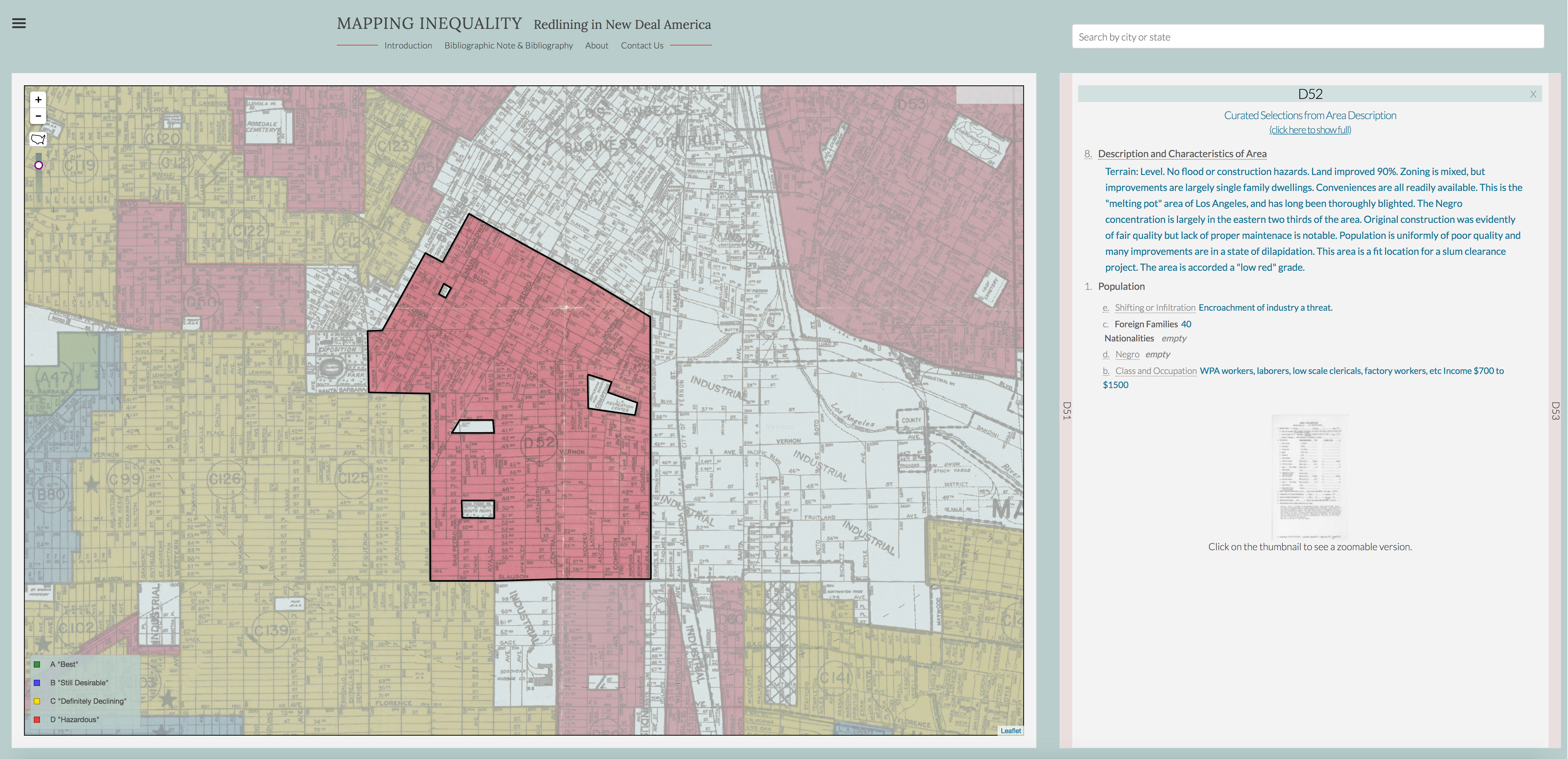
If you zoom to Los Angeles, CA in Mapping Inequality (I recommend taking a moment to read the short introduction and how to) you will see the historic redline maps overlaid on a web-based map, a color-coded legend that describes areas from Best to Hazardous, and an information panel where you can immediately explore an overview and download raw data. Zoom in further, click a red section of the map, and the “area description” will load in the information panel. The initial view is curated and gives you an immediate impression of how these maps and accompanying documents perpetuated and institutionalized discrimination. You can also view the full demographic data and a scan of the original paperwork.
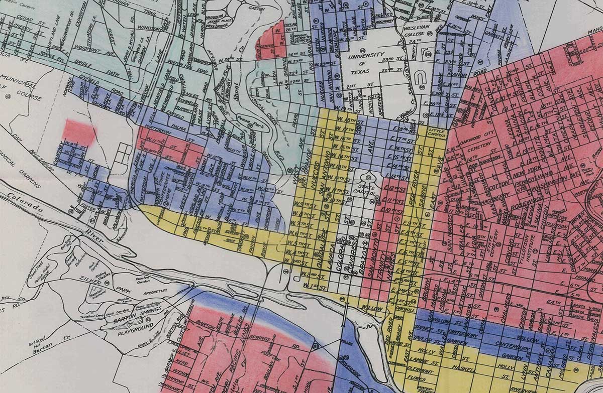
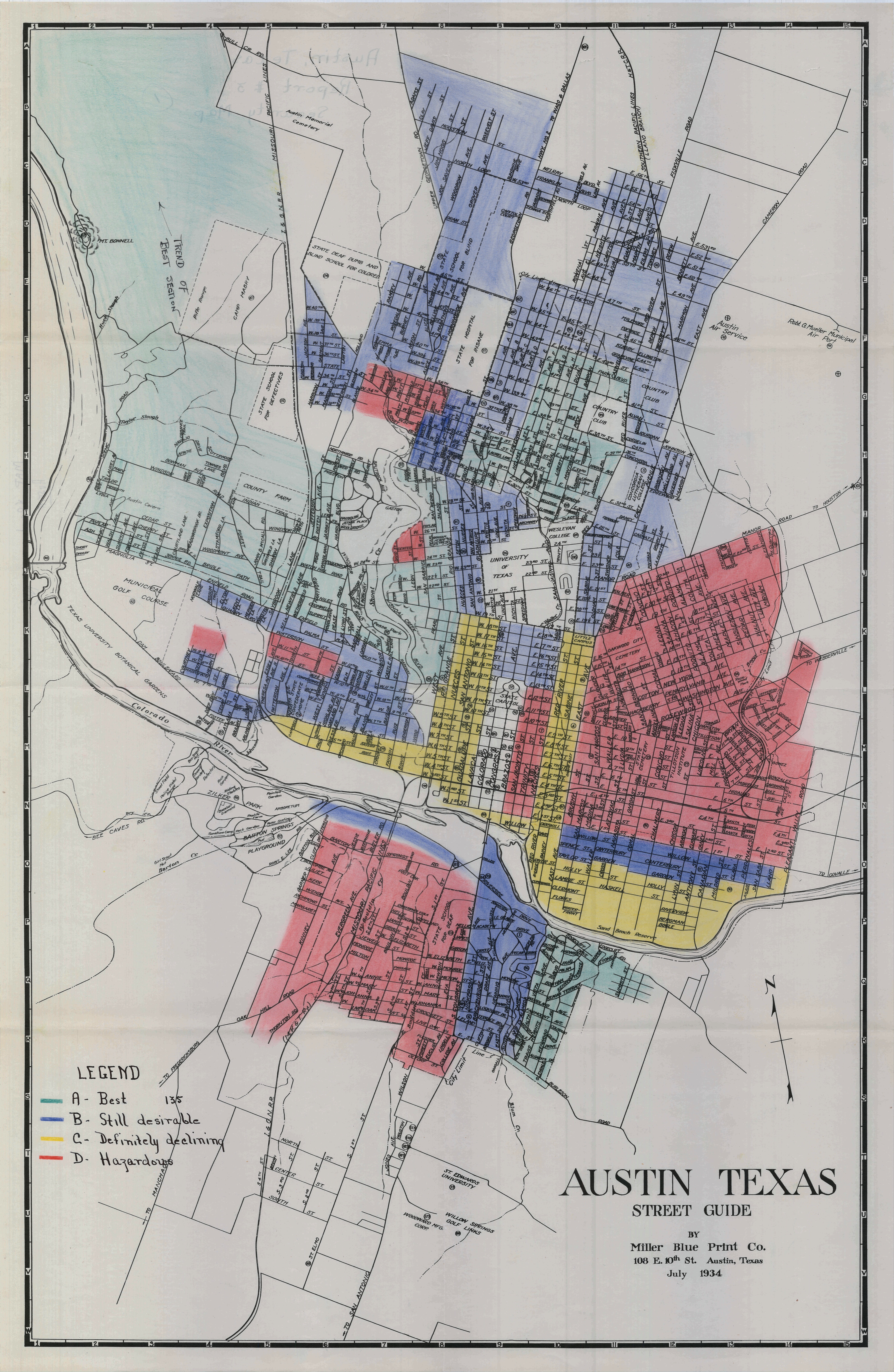
I encourage you to look at cities you are familiar with, it’s startling how the effects of these maps are apparent today. This is a work in progress so not every city surveyed by the HOLC is represented or complete. Unfortunately, the accompanying documents for Austin are not available, but you can view the entire 1935 Austin map on the PCL Map Collection website. (You can also find a digitized reprint of the notorious Austin city plan from the 1920s at Texas ScholarWorks.)

I chose to highlight this mapping project because redlining maps are a critical example of the power of maps and this interface was beautifully constructed to illustrate their impact.
Mapping Inequality is part of American Panorama: An Atlas of United States History. While American Panorama is a project by the Digital Scholarship Lab at the University of Richmond, Mapping Inequality is a product of many collaborations. Participants from universities across the country worked on many aspects of the data collection and transcription and the Panorama toolkit, open source software used to create these maps, was developed by Stamen Design. I also recommend exploring the latest map added to American Panorama, Renewing Inequity: Urban Renewal, Family Displacements, and Race 1955-1966.